Quantcast
Channel: Color Theory & History – Munsell Color System; Color Matching from Munsell Color Company
Viewing all 100 articles
Browse latest View live

What Color is Chocolate?

$
0
0
5 swatches of various shades of chocolate colors

The Color Chocolate History

The questions I have been investigating lately is when did, “chocolate” become a word to describe a color and what color was that, exactly?  These questions are not as simple as they may seem; the answers have much to do with the cultural history of chocolate and how color gives flavor to our lives.

In the Central American homeland of chocolate, cacao-rich foods and drinks have been a part of life for thousands of years. Linguists debate about the origin of the word “cacao”, the tree seed from which chocolate is made, but it is clear that the word for cacao is very old indeed. The word ‘chocolate’ in Mexico and Central America, however, is a relative newcomer, a Nahua word, from the same language family as the Nahuatl the Aztecs spoke. In pre-Columbian writing, chocolate and cacao indicate substances, not colors.

In the sixteenth century, chocolate was widely known as a special drink from colonial Guatemala (that also included today’s El Salvador). European colonists consumed cacao-based beverages as early as the sixteenth century, but “chocolate” did not immediately become part of the vocabulary of other languages such as Spanish, English, or French when they started consuming cacao-laced foods and drinks. Chocolate was a substance so unusual that Europeans did not re-use a familiar word to describe it—they adopted the foreign Nahua name. So, when did this foreign substance infiltrate European ideas about color?

Chocolate as a Color

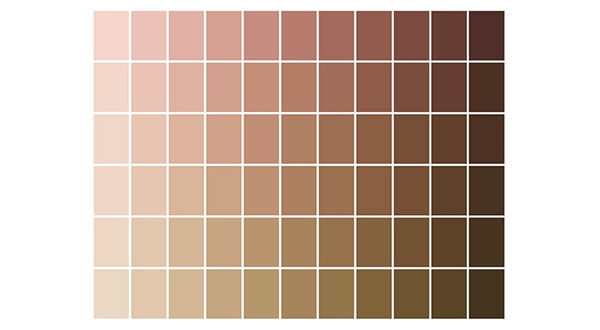
The idea of chocolate as a color shows the gaps we face among the documentary, visual, and material records. Chocolate came in many different forms and colors, so figuring out what tint people called “chocolate” says much about what the iconic feature of chocolate was. Early uses of the word “chocolate” as a color do not appear until the early eighteenth century, after Europeans had been consuming chocolate for some time. This new use of the word indicates a broad enough familiarity with the substance that it made sense, and it happened at about the time of an upswing in popularity of browns.[1]

An excerpt from a book that featured various shades of chocolate colors

Figure 1. Color samples of browns, p. 74, in Werner’s nomenclature of colours : with additions, arranged so as to render it highly useful to the arts and sciences, particularly zoology, botany, chemistry, mineralogy, and morbid anatomy : annexed to which are examples selected from well-known objects in the animal, vegetable, and mineral kingdoms (1821), Werner, Abraham Gottlob; Syme, Patrick, editor; James Ballantyne and Co., printer, Edinburgh : Printed for William Blackwood, Edinburgh, and T. Cadell, Strand, London (https://archive.org/details/gri_c00033125012743312).

An early use of ‘chocolate’ as a color occurred in William Salmon’s 1734 Palladio Londinensis, Or the London Art of Building to describe a house paint color. A detailed 1692 color guide written in Dutch includes many shades of brown (Figure 1). Likewise, in the historic textiles and clothing in the collection of the Colonial Williamsburg Foundation, browns are popular from about 1740-1760. Of all these browns, which one was “chocolate” brown? In the seventeenth and eighteenth century, chocolate was consumed as a frothy drink rather like today’s lattes, but it was also eaten as a paste and sold in tablets and bars. The lighter browns most closely match the foam of whipped chocolate, while darker browns best match the liquid from the drink or even solid chocolate.[2]

5 swatches of the color chocolate brown

Figure 2., Folio 65r of Traité des couleurs servant à la peinture à l’eau, a manuscript from 1692, (http://www.e-corpus.org/notices/102464/gallery/773852)

One of the best clues about the hue of chocolate comes from the 1821 edition of Werner’s nomenclature of colours (Figure 2), which includes both a color description and sample. Curiously, “chocolate” describes a red, not a brown (Figure 3). Browns are named for other food terms, such as clove, broccoli, and chestnut. All of this highlights that ideas of color are very much rooted in personal experience. Choices in names evoke a whole slew of associations.

An excerpt from a book defining the colors chocolate red and brownish red

Figure 3. Color description of “Chocolate Red,” p.71 in Werner’s nomenclature of colours.

Determining the Colors of Chocolate

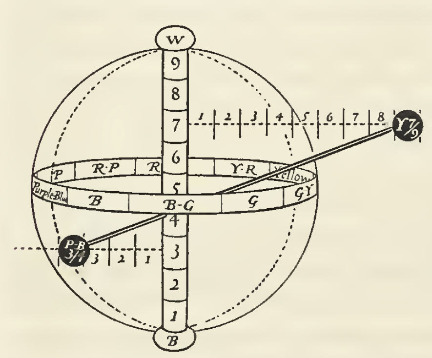
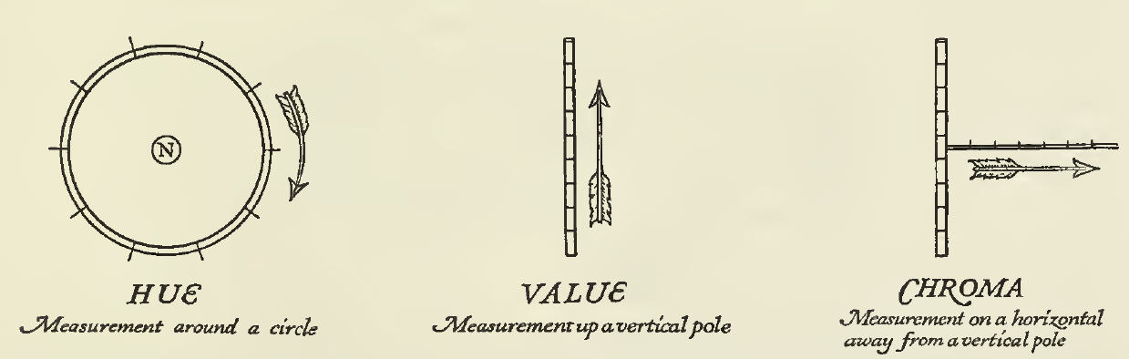
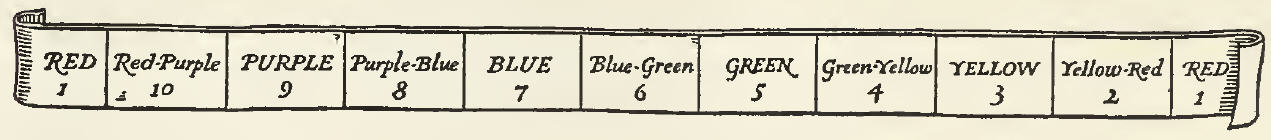
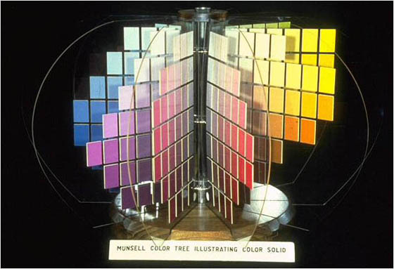
How then, can we pin down “chocolate brown” today? The Munsell color guide provides a kind of Rosetta Stone to translate historic uses of color names and examples into a standard color vocabulary of scales in hue and chroma. The Munsell system avoids references to plants, foods, or animals–quirky, experience-based terms–in favor of more widely applicable descriptions such as “strong” or “very dark.” While we do not find “chocolate” in the Munsell Color Guide, it offers a way to evaluate all the historical nuances of chocolate and personhood; we can see chocolate more clearly. Munsell is a tool of the present to understand color vocabulary of the past.


[1] See more about color and clothing here: http://kathrynsampeck.wordpress.com/2013/09/27/the-color-of-its-countries-chocolate-clothing-and-personhood-in-the-eighteenth-century/

[2] An earlier Munsell blog has excellent examples of chocolate colors: http://munsell.com/color-blog/chocolate-color-notation/

About the Author

A smiling Kathryn Sampeck sitting in front of a plate of different colored chocolatesDr. Kathryn Sampeck is an Assistant Professor of Anthropology at Illinois State University. She earned her B.A. and M.A. from the University of Chicago and her Ph.D. from Tulane University. Her research focuses on the archaeology and ethnohistory of Spanish colonialism, Mesoamerican literacy and writing, and the social history of American commodities such as cacao. Sampeck has been awarded fellowships by the John Carter Brown Library and the John D. Rockefeller Library, Colonial Williamsburg as well as grants by the National Science Foundation, Wenner-Gren Foundation for Anthropological Research, Social Science Research Council, Fulbright program, and Cherokee Preservation Foundation. Her publications include articles in the International Journal of Historical Archaeology, Mesoamérica, Ancient Mesoamerica, and La Universidad, as well as forthcoming works in American Antiquity, Historical Archaeology, and Ethnohistory. She tweets and posts about colonial life, Latin America, archaeology, and chocolate regularly—follow her on Twitter, Instagram and her blogs on http://kathrynsampeck.wordpress.com/ and http://colonialcherokeearchaeology.blogspot.com/ – See more at: http://munsell.com/color-blog/brown-soil-color-chart-archaeology/#sthash.0insfWdI.dpuf


A Grammar of Color – Part 1

$
0
0
Cover plate for A Grammar of Color, a 1921 book about the Munsell Color System.

Arrangements of Strathmore Papers in a Variety of Printed Color Combinations According to The Munsell Color System

A Grammar of Color was published in 1921 by the Strathmore Paper Company and was intended to explain the Albert H. Munsell color system and then show how it can be applied. The book was 27 pages long, with illustrated text explaining the color dynamics by principle and applications, as well as two plates engraved by Rudolph Ruzicka showing balanced and unbalanced color and 19 folding sample color sheets of Strathmore papers that demonstrate various color combinations. Long out of print, it has become a collector’s item. Now the content is available for you to view through a series of posts in the Munsell Color Blog.

Cover of A Grammar of Color book, by Munsell and Cleland

The book contains an introduction from Albert Henry Munsell (posthumously), followed by explanatory text and diagrams illustrating the application of the color system by Thomas Maitland Cleland, entitled “A Practical Description of the Munsell Color System with Suggestions for Its Use”. After suggestions for how the book should be used and how the book was printed, the rest of the book consists of fold-outs of various colored Strathmore cover papers printed with measured color areas arranged according to the Munsell Color System.

A Grammar of Color Inside Page

So stay tuned to the Munsell Color Blog for new installments of chapters from the book, or check back to this post as we will link to the each chapter here as they are published. See the bottom of this page to subscribe to the Munsell Color Blog and receive updates in your email.

“A Grammar of Color” Chapters:

A Grammar of Color – Part 2: Preface

$
0
0
The Preface chapter heading with decorative embellishment from the book on Munsell Color Theory, A Grammar of Color.

In 1921 the book, “A Grammar of Color” was published by the Strathmore Paper Company to explain how the Munsell color system can be applied. This Preface was written by the Strathmore Paper Company. They point out how difficult and expensive it was to produce this book, as well as a note about Albert Munsell, his interest in producing this book, and his recent passing.

The Preface is presented here as part of series to make the entire contents of “A Grammar of Color” available online here in our Munsell Color Blog.

Cover plate for A Grammar of Color, a 1921 book about the Munsell Color System.

Like any other work undertaken in a new field, this book has grown prodigiously since its first inception and the task and expense involved in producing it has mounted with its development at a rate which appeared, at times, to seriously threaten its completion. It is, therefore, with what we feel to be a justified sense of pride and satisfaction that this company is able to offer to printers, publishers, advertisers and all others who have occasion to use color a book which, though it calls attention to our own product in the field of paper making, may also add its quota to the sum of human knowledge and be of lasting usefulness to our many friends.

This book presents a system for the measurement of color and for its orderly use, and demonstrates this system upon a number of cover papers selected from the extensive Strathmore lines. The fact should be emphasized that neither the Munsell Color System nor this exposition of it is intended to present a creed or dogma for the use of color, nor to supplant the exercise of instinct and trained perception. It is intended as an aid to the training of a color perception and the quickening of an instinct for color, but failing even in this, a reasonably close adherence to the principles which it puts forth will certainly help to avoid the outrages upon color harmony which are committed in every-day practice.

It is regrettable to have to record here the death of Professor Munsell but a little time before the work of printing this book, the first to treat of the practical application of his theories to a great industry, was actually started on the press. He had manifested an earnest interest in its conception and would have taken keen enjoyment from surmounting the difficulties of producing it. Thus deprived of his wise counsel and his enthusiasm, all concerned in the making of this book have found their task the greater, though not the less worth while.

STRATHMORE PAPER COMPANY

[ 5 ]


Image of the Preface pages from the book, A Grammar of Color, about the Munsell Color System 

This book was arranged and prepared with the authority of the late A. H.  Munsell of Boston, who spent his life in the perfecting of the Munsell System of Color, and it is the first presentation of this system to the Printing, Advertising and Paper Trade.

The book was designed in its general form and the color sheets have been designed and patented by Arthur S. Allen of New York, who also selected and arranged all of the color combinations shown in it.

The decorations throughout the text, and the type composition of this book, were designed and executed by T. M. Cleland of New York, who also executed the presswork on the color sheets.

The presswork of the text forms, title page, and the color plates by Helen Dryden, was executed by the Redfield-Kendrick-Odell Co. Inc., New York.

The decorative designs on the color sheets and the areas showing color combinations were designed and executed by Rudolph Ruzicka of New York.

The inks used throughout are manufactured and sold by Philip Ruxton, Inc., New York, Chicago and Boston. Any of these may be ordered by the Munsell System of Notation, thus: R5/5 which means Hue, Red; Value, 5; Chroma, 5. These letters and numbers are shown at the right of each pair of color areas on the color sheets.

This book was produced by the Advertising Department of the Strathmore Paper Company, under the direction of C. W. Dearden.

The binding of this book was executed by the Eugene C. Lewis Company, New York, under the personal supervision of Raymond E. Baylis.

[ 6 ]

Related Links

A Grammar of Color – Part 3: Introduction to the Munsell Color System – The Color Sphere

$
0
0
Cover Plate for "A Grammar of Color" and "The Color Sphere" heading title - Image from A.H. Munsell's Introduction - The Color Sphere

A. H. Munsell provided the Introduction for the 1921 book, A Grammar of Color, which was published posthumously by the Strathmore Paper Company. The introduction includes sections on The Color Sphere, Balance of Color, and Unbalance of Color.We are presenting each section of the Introduction as well as the rest of the book as part of series of blog posts to make the entire text available online here in our Munsell Color Blog. This section, The Color Sphere, addresses an explanation of color relationships and defining a color notation represented in the form of a color sphere.


An Introduction to the Munsell Color System By A.H. Munsell

The Color Sphere

A CLEAR mental image of color relations must underlie any intelligent grouping of its hues in the best degrees of strength and light. This image is best produced by using a sphere to represent the world of color. With white at the North pole and black at the South pole; and its axis between these points a measured scale of grays, we have a decimal neutral scale which painters call Value. The middle point of this axis must be a middle gray and a plane passing through to the equator must contain colors of middle value. If therefore the equator be spread with a color circle of Red, Yellow, Green, Blue, Purple; and the half-way points by their mixtures in Yellow-Red, Green-Yellow, Blue-Green, Purple-Blue, Red-Purple, we have the equator as a decimal scale of hues merging gradually from one to the next and returning upon itself at Red. Each of these hues is supposed to grow lighter until it merges into the North pole at white, and darker similarly to black, and these are called the values (light) of color. They may also be imagined as passing inward until they disappear in the gray axis. Should there be still stronger colors they will continue upon the same radii outside the sphere. These we call the Chromas (strength) of color. In this way every point inside of the sphere and some upon the outside are arranged in three scales as follows : A vertical scale of light values, a horizontal scale of Chromas, and a circular scale of Hues; and since these are all in decimal divisions it becomes easy to make it a permanent mental image in which to see all color relations. Naturally every point in these three scales has its defined number, just as a solid object has its three dimensions; and to write them as a symbol of that color, thus doing away with the foolish misleading names which are prevalent, we have only to image the three angles of a triangle occupied with the three parts of that symbol—the left hand angle by the Hue initial (Red, Yellow-Red, etc.); the upper angle by a number describing its value in the scale of light; and the right hand angle by a similar number describing its Chroma in the scale from the axis outward. Thus, Vermillion has for its symbol R5/10.

This may seem revolutionary to the business man who has heard no end of fanciful names which fail to describe colors; but each symbol accurately describes the color in its dimensions of Hue, Value and Chroma.

This has all been worked out in permanent color in the “Atlas of the Munsell Color System” and each step bears its permanent symbol. There can be no new color discovered for which a place and symbol is not waiting. With this system in mind it is as easy to understand color relations as to understand musical relations on the written score. Indeed it furnishes the written score which is described in the hand book “A Color Notation.” From this “Atlas”* the pairs of colors shown on each page of this book are mere suggestions to the color printer of combinations which harmonize with that particular cover paper. Always refer back to the “Atlas of the Munsell Color System”* where many other combinations are awaiting.

 The Color Sphere from A Grammar of Color, in the Introduction to the Munsell Color System by A.H. Munsell.

* “A Color Notation” and the “Atlas of the Munsell Color System” may be purchased at any bookstore.

Related Links:


A Grammar of Color – Part 4: Introduction to the Munsell Color System – Balance of Color

$
0
0
Book Cover Plate for "A Grammar of Color" and "Balance of Color" heading title - Image from A.H. Munsell's Introduction - Balance of Color

Balance of Color, explains the application of color balance and provides three color composition examples that achieve balance, using the color sphere. It is a section of the Introduction for the 1921 book, A Grammar of Color, written by A. H. Munsell. This book was published posthumously by the Strathmore Paper Company. The introduction includes sections on The Color Sphere, Balance of Color, and Unbalance of Color.

We are presenting each section of the Introduction as well as the rest of the book as part of series of blog posts to make the entire text available online here in our Munsell Color Blog.


An Introduction to the Munsell Color System By A.H. Munsell

Balance of Color

The sense of comfort is the outcome of balance, while marked unbalance immediately urges a corrective. That this approximate balance is desirable may be shown by reference to our behavior, as to temperatures, quality of smoothness and roughness, degrees of light and dark, proportion of work and rest. One special application of this quality is balance which underlies beautiful color. The use of strongest colors only fatigues the eyes, which is also true of the weakest colors. In a broad way we may say that color balances on middle gray. Thus a moderate amount of extremely strong color may be balanced by a right quantity of grayer color; and a brilliant point of strong red will balance a larger field of the grayest blue-green. Thus AREA is another quality in color composition, which aids in the balance of Hues, Values and Chromas. Examples of this are all about us. The circus wagon and poster, although they yell successfully for our momentary attention, soon become so painful to the vision that we turn from them. Other examples are magazine covers and the theatrical billboard. These are all cases where color is used only to excite the eye but not for its permanent pleasure. In the case of this book of cover papers, the problem is to so soothe and please the eye that the attention will remain upon them and the applied colors, thereby enhancing the appearance of the paper chosen. The large truth is that general color balances approximately upon middle gray. Although the colors may differ greatly, yet their total effect is balance.

Let us take a point upon the color sphere such as R5/5 . There are three distinct color paths for which this becomes the center. First a vertical path which extends from black through red to white; and in a decimal system is divided into ten equal steps. Equal departures either way from middle red must balance, such as R7 with R3, R8 with R2, R6 with R4, while the strength may be used so as to require equal or unequal areas of each balanced pair. The general law being, that the stronger the color we wish to employ, the smaller must be its area; while the larger the area, the grayer the Chroma. Thus R7/6 balances R3/3 in the proportion of nine parts of the lighter red to forty-two parts of the darker red.* In other words, these symbols will balance colors inversely as the product of their factors. This opens up a great field of area in the use of reds, where balance may be restored by changes in the factors of Value and Chroma. Thus the lighter red (R7/6) which we will call 42 balances the darker red 3/6 which we will call 9, by giving 42 parts of the darker (weaker) red to 9 parts of the lighter (stronger) red.

A second path through Middle Red follows the equator of the sphere and again we may balance the Hues once or twice removed; as for instance, RP and YR or P and Y. These are called the neighbors of Red, popularly known as its shades. Instead of neighbors we may select the exact opposite of Red, Blue-Green, which is known as its complement, using equal areas if the colors are of equal strength or increasing the area of the weaker color. This second path does not depart from the level of the equator and therefore all the colors named are of a single Value without contrast of light and dark.

A more interesting path is the third, which may be passed through Middle Red, being neither vertical nor horizontal; but inclined so that if it passes upward out of Red toward lighter Purple it will pass downward from Red into darker Yellow.

These three examples must suffice as a brief introduction to almost endless examples of color series and color intervals that are orderly and harmonious to the eye.

*There is a typo in the original book. It should read: Thus R7/6 balances R3/6 in the proportion of nine parts of the lighter red to forty-two parts of the darker red.

A Grammar of Color – Part 5: Introduction to the Munsell Color System – Unbalance of Color

$
0
0
The book Cover Plate for "A Grammar of Color" and heading title, "Balance of Color" from A.H. Munsell's Introduction.

Using examples like discords in music, A.H. Munsell explains the concept of unbalance of color in this section of the Introduction for the 1921 book, A Grammar of Color, published posthumously by the Strathmore Paper Company.

We are presenting each section of the Introduction as well as the rest of the book as part of series of blog posts to make the entire text available online here in our Munsell Color Blog. The introduction includes sections on The Color Sphere, Balance of Color, and Unbalance of Color.


An Introduction to the Munsell Color System By A.H. Munsell

Unbalance of Color

That any long duration of unbalance, either mental, physical or spiritual is an aggravated form of disease may be easily shown. Yet short periods of unbalance are very stimulating in the effort which they produce to regain balance. We see this in the introduction of discords in music. In contortions of the body. In intentional inversions of thought. This also shows in the seasoning of our food. Too sweet, too salt, too sour. It even shows in our criticism of pictures. We say, too light, too dark, too hot, too cold, too weak, too strong, and the effort of the accomplished artist is to overcome these forms of unbalance. The introduction of a color scheme of a certain moment of unbalance is called harsh color, it leads to its correction by what we call harmonious color (really balance); and the contrast enhances the latter; so that to overcome monotony, we should be able to use unbalance wisely at times, in order that the general balance may be the more evident. This is sometimes done in the picture gallery by means of a so called “gallery of horrors;” — in music by a sudden discord; in behavior by an unexpected rudeness;— all illustrations of the value of the contrast between harmony and discord; and this quality of contrast is proportioned to the use of color. If it is to serve as the background of the picture, the color must be quiet. If it is to be the makeup of the pictures themselves there must be strong oscillations in the contrasts of light and dark (Value), of hot and cold (Hue), of weak and strong (Chroma). As in the case of advertising color, especially in the open air, the very strongest contrasts and even strident relations are admissible. Any attempt in this sketch to encompass this broad question of color harmony would be impossible, and only the few suggestions are attempted to balance and unbalance, to contrast and to accent here mentioned, with their limited illustrations printed in the colors of the various cover papers.

Related Links:


Atlas of the Munsell Color System

$
0
0
Atlas Munsell Color System Book Cover

The Atlas of the Munsell Color System was first published in 1913. It consisted of two sets of charts (15 in total), illustrating the Munsell system of color measurement. We have uploaded a PDF of the Atlas from the original first printing – yellowed, worn pages and all. Below is an outline of what the book covers.

The Color Atlas Outline

Introduction

The color system defined including paragraph descriptions of the following:

Three Color Scales Unite in a Sphere
A Color Tree Surrounds the Color Sphere
Notation of Colors by Symbols
Charts of the Color System
Balance of Color by a Sphere

Chart H

Scale of Hues.
Index for color notation: hue, value and chroma.

Chart V

Axis of the Color Tree.
Value, i.e. the amount of light reflected from pigments,  is the second dimension or quality of color.

Chart C

Chromatic Branches of the Color Tree.
Chroma, i.e. the strength of pigment colors, is the third dimension of color.

Chart R

Scale of Chromas. Red and Blue-Green Chart.
This chart presents a vertical plane passed through the axis of the color  solid and bearing the complementary hues, red and blue-green.

Chart Y

Scale of Chromas. Yellow and Purple-Blue Chart.
This chart presents a vertical plane passed through the axis of the color  solid and bearing the complementary hues, yellow and purple-blue.

Chart G

Scale of Chromas. Green and Red-Purple Chart.
This chart presents a vertical plane passed through the axis of the color  solid and bearing the complementary hues, green and red-purple.

Chart B

Scale of Chromas. Blue and Yellow-Red Chart.
This chart presents a vertical plane passed through the axis of the color  solid and bearing the complementary hues, blue and yellow-red.

Chart P

Scale of Chromas. Purple and Green-Yellow Chart.
This chart presents a vertical plane passed through the axis of the color  solid and bearing the complementary hues, purple and green-yellow.

Chart 20

Dark Scales of Hue and Chroma, Reflecting 20% of the Incident Light.
This chart is a horizontal section through the color solid, similar to chart 50  except that the shorter radii describe a loss of chroma as colors darken.

Chart 30

Dark Value Scales of Hue and Chroma.
This chart is a horizontal section through the color solid, similar to that of  chart 50 except all its colors reflect 30% of the incident light.

Chart 40

Scales of Hue and Chroma, Reflecting 40% of the Incident Light.
This chart is a horizontal section through the color solid, similar to  chart 50 except that all its colors reflect 10% less light.

Chart 50

Middle Value Scales of Hue and Chroma.
This chart is a horizontal section through the color solid, classifying all colors of  Middle Value, by measured scales of Hue and Chroma.

Chart 60

Scales of Hue and Chroma Reflecting 60% of the Incident Light.
This chart is a horizontal section through the color solid, similar to  chart 50 except that all its colors reflect 10% more light.

Chart 70

Light Value Scales of Hue and Chroma.
This chart is a horizontal section through the color solid, similar to  chart 50 except that all its colors reflect 70% of the incident light.

Chart 80

Light Scales of Hue and Chroma, Reflecting 80% of the Incident Light.
This chart is a horizontal section through the color solid, similar to chart 50 except  that the relative chromas change as their hues approximate to white.

From Atlas to Color Book

The Atlas was re-published in 1929 as The Munsell Book of Color which still bears that name today. Are use using these color charts in your work? If so, we would love to hear about it.

A Grammar of Color – Part 6 – A Practical Description of the Munsell Color System with Suggestions for Its Use: Hue, Value, Chroma

$
0
0
Chapter Heading from A Grammar of Color: A Practical Description of the Munsell Color System with Suggestions for its Use

We continue with our series of excerpts from the 1921 book, A Grammar of Color. The previous excerpts covered the chapters written by A.H. Munsell himself, entitled “An Introduction to the Munsell Color System”. The next series of excerpts will cover sections of the chapter, “A Practical Description of the Munsell Color System with Suggestions for its Use” which were written by T.M. Cleland, an American book designer, painter, illustrator, and type designer. He explains in detail the definition of hue, value, chroma – the three dimension of color in the Munsell Color System. Future excerpts will include practical examples of opposite or complementary colors, balance and color combinations.

So let’s get started with his explanation of the three dimensions of color and the definition of hue, value and chroma.


A Practical Description of the Munsell Color System with Suggestions for its Use

Section One: Hue, Value, Chroma

By T. M. CLELAND

In the introductory text, written especially for this book by Professor Munsell, will be found a brief compendium of his theories upon the dimensions of color and color relations, which though generally scientific in form, is stated with such admirable simplicity and absence of scientific verbiage that it merits the careful study of all practical workers, who would understand the basic idea upon which the matter of this book is built.* It has been thought wise, however, by the publishers to augment this with a practical description with illustrations of the cardinal principles of the Munsell System, more especially with a view to its actual use in printing and advertising, or in what has come to be generally known as the Graphic Arts. In so doing, there must necessarily occur a reiteration of much that appears in Professor Munsell’s introduction, but its being expressed in different form, may tend to assist the practical reader toward a clearer comprehension.

The first essential to the application of the Munsell System is a clear understanding of the three dimensions of color, and once having grasped the simple logic of these, the practical advantages of the System will be manifest. The reader should be warned at the outset against that fear of scientific perplexity which is ever present in the lay mind. The three dimensions of color are not involved in the mysteries of higher mathematics. There is nothing about them which should not be as readily comprehended by the average reader as the three dimensions of a box, or any other form which can be felt or seen. We have been unaccustomed to regarding color with any sense of order and it is this fact, rather than any complexity inherent in the idea itself, which will be the source of whatever difficulty may be encountered by the reader, who faces this conception of color for the first time.

On the second of the three gray sheets which precede the other color sheets of this book will be found a colored diagram, accompanied by an explanation which has been made especially to present the three dimensions concretely and to avoid the abstractions of written explanation. The idea of the three dimensions of color can be even more simply, though less completely, expressed thus:

Visual expression of the three dimensions of color - HUE: Measurement around a circle. VALUE: Measurement up a vertical pole. CHROMA: Measurement on a horizontal away from a vertical pole

With these three simple directions of measurement well in mind, and by reference to the diagram mentioned above, where actual colors are printed, there need be little confusion for even the least scientific mind in comprehending what is meant by color “measurement.” In considering further the qualities of color, which are expressed by these three dimensions known as Hue, Value and Chroma, we will take each one of them separately in the order in which they are written, trusting that having done so we may pass to the subject of color balance or harmony and its application to every-day practice, equipped with a clear understanding of how it may be measured and noted.

*It should also be borne in mind that this system does not deal with the pure science of color as wave lengths of light, but merely with color as manifested and commonly used in pigments.

I. HUE

This first dimension is defined by Professor Munsell as “The quality by which we distinguish one color from another, as a red from a yellow, a green, a blue or a purple,” but this dimension does not tell us whether the color is dark or light, or strong or weak. It merely refers to some point in the spectrum of all colors, such as we have seen in the reflection of sunlight through a prism. Let us suppose now that we had such a spectrum cast by a prism, or a section taken out of a rainbow. We know it to be a scientific fact that it contains all possible hues, merging by indistinguishable degrees, one into the other, but always in a fixed order. Now let us imagine that we have such a spectrum fixed or printed on a band of paper, and that it begins at one end with red and going through all possible hues, it arrives back at red again at the other end. The hues are unevenly divided and they merge one into the other by indistinguishable degrees. But still preserving the order of these hues, let us divide them into equal steps as we do a ruler into inches, by selecting certain colors familiar to us in every-day use — red, yellow, green, blue and purple. These we will call the Simple Hues, but between each of them we will make another division where each merges into the other. These we will call yellow-red, green-yellow, blue-green, purple-blue and red-purple and they will be known as Compound Hues, because each of them is compounded of two Simple Hues.*

*In the naming of these steps of Hue, Professor Munsell has wisely adopted a terminology which is commonly understood as referring only to color, and has avoided the use of such terms as orange, pink, violet, etc., which have other meanings and might lead to confusion. What is called orange, for example, he calls yellow-red because it is a mixture of these two hues.

Band showing hue colors, labeled from 10 down to 1: 1: Red, 10: Red-Purple, 9: Purple, 8: Purple-Blue, 7: Blue, 6: Blue-Green, 5: Green, 4: Green-Yellow, 3: Yellow, 2: Yellow-Red, 1: Red.

Thus we shall have 10 divisions upon our band. The reason for this number of divisions will be understood when we come to consider the question of Color Balance. It presents a sufficient variety of hues for purposes of demonstration, and for most practical uses. Now if we bend this band around into a circular hoop, so that the red at one end meets and laps the red at the other end, we have a perfect scale of Hue in the circular form in which we shall always consider it. So it is that when we state the first dimension of a color we are merely referring to its position on this circle of hues. In writing a color formula this first dimension is expressed by the initial letter of the Hue — R for red, which is a Simple Hue, and B-G for blue-green, which is a Compound Hue.

Illustration of a hand holding a circular band with the 10 hue colors written on it to represent the Hue dimension of the Munsell Color System.

These 10 steps being a decimal number, may, of course, be infinitely subdivided and it may frequently happen, as it does in the color areas printed in this book, that a given color does not fall exactly on any one of these 10 divisions of Hue, but somewhere between two of them. Allowance has been made for this by dividing each of the steps of the Simple Hues into 10 further divisions. These 10 subdivisions represent about as fine a variation of Hue as even a trained eye can distinguish, and it would be obviously futile, for practical purposes, to carry it further. If we uncurl our band again, in order to better see what we are doing and note these divisions upon it, they will appear in this order:

Illustration of a long band subdivided into 10 numbers per simple hue to represent variations in Hue in the Munsell Color System.

Reading from right to left, beginning at the left of a Compound Hue, the numerals run from 1 to 10, 5 always marking a Simple Hue and 10 falling always on a Compound Hue. Thus we have a series of numerals denoting any practical step or gradation between one hue and another and in writing a color formula, of which one of these intermediary hues is a part, we place the numeral, denoting the position of the hue on this scale, before the letter which stands for the nearest Simple Hue, thus 7 R, 2 Y, etc. If, for example, we wish to write the formula of a color, the hue of which is neither Red nor Yellow-Red, but about halfway between the two, we would write it 7 R or 8 R, according as it was nearer to the Red or to the Yellow-Red.

II. VALUE

Illustration of a vertical pole with gradiations in darkness, with White at the top and Black on the bottom and showing where Pink and Maroon are represented on this scale to demonstrate the Value dimension in the Munsell Color System.
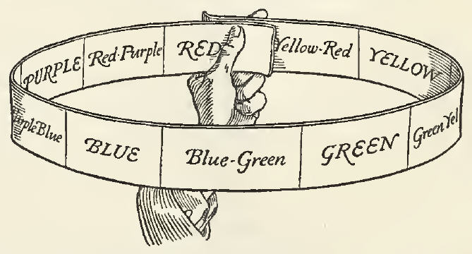
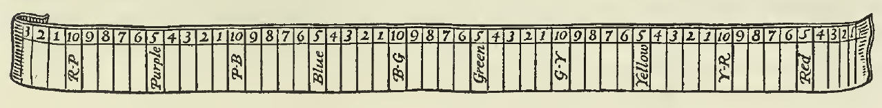
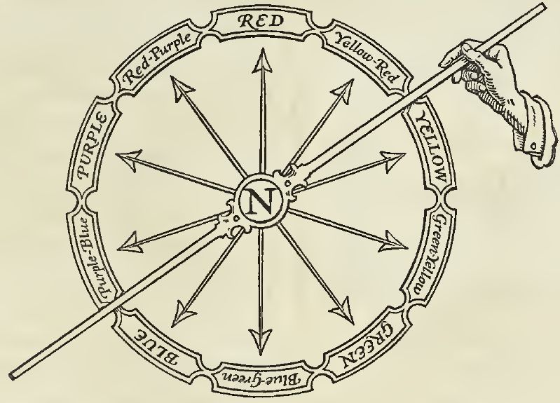
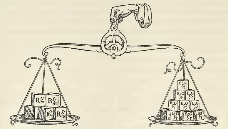
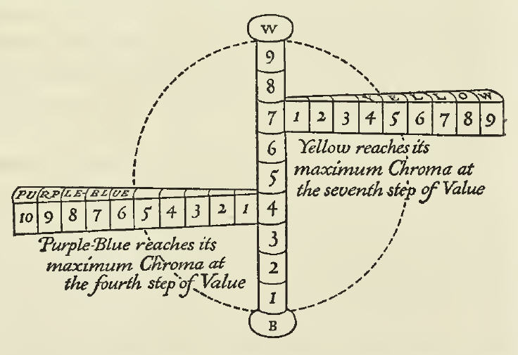
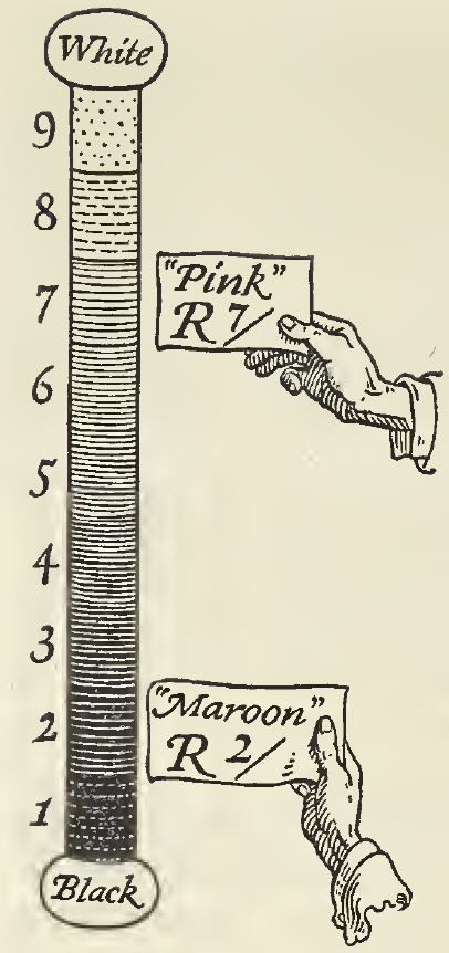
This is the second dimension and is possibly the simplest to understand. It is, according to Professor Munsell’s definition, “The quality by which we distinguish a light color from a dark one.” We noted that the first dimension did not tell us whether a color was light or dark. It told us, for example, that it was red and not green, but we know that there may be light red and dark red, and it is the function of this
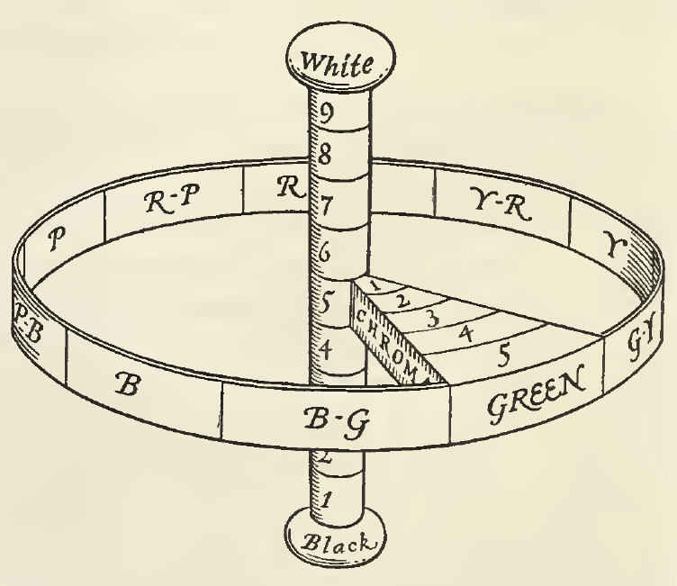
 dimension of Value to tell us how light or how dark a given color may be. For this purpose we shall need a scale of Value, which we may conceive as a vertical pole, or axis to our circle of Hues, black at the lower end, representing total absence of light, and white at the top, representing pure light, and between these a number of divisions of gray, regularly graded between black and white. This gradation could also be infinite. Since pure black is unattainable, we will call that 0 and begin our scale with the darkest gray as 1, numbering the steps up to 9, which is the lightest gray. Pure white, which is also unattainable, we will call 10. In the practical use of the scale of Value, therefore, we shall have but 9 steps and the middle one of these will be 5 — what is referred to as Middle Value. This scale of Value, or neutral pole, is well represented on the colored diagram already referred to, where it is shown with the actual gradations printed. These steps of Value have been scientifically measured and registered by means of an instrument known as a Photometer.* In writing a color formula we express this dimension of Value by a numeral, which denotes at what step upon the scale of Value this color falls. This numeral is written above a line, as B6/ for example, by which we mean that this particular blue, regardless of its other qualities is as light or as dark as the 6th step upon the scale of Value. A color such as is commonly called “maroon” is an example of a red which is low in Value, because it is dark, and what is called “pink” is a red which is high in Value because it is light.

Now having familiarized ourselves with these two dimensions, and understanding what qualities of a color they express, we may proceed to consider the third dimension, without which our description of any given color is incomplete.

* The Munsell Photometer and the readings of Value made with it have been accepted as scientifically correct. This instrument is described in Professor Munsell’s book “A Color Notation.”

III. CHROMA

When we have stated that the color is blue or yellow or green and that it is dark or light, we have indicated two of its important qualities — its Hue and its Value, but we have by no means described it completely. We may say of an emerald that it is green and that it is light, but we can say that certain grapes are green and also light, and yet there is a decided difference between their respective colors, if we place them side by side. Both may be green and of the same Value of light, but the emerald is strong in color and the grape is weak in color or grayer. It is this difference which is measured on the dimension of Chroma. The scale of Value has been referred to in the convenient and easily understood form of a vertical pole, which represents a neutral axis to all the circle of hues and is, itself, of no color, but is pure gray. Around this pole we may place our band representing the scale of Hue and then if we imagine any one of these hues on the circumference of the band to grow inward toward the gray pole in the center, growing grayer or weaker in color strength until it reaches this center pole and loses its color entirely, we have grasped the idea of the dimension known as Chroma. By dividing this into regular measured steps, we have a scale upon which the strength of color may be measured. This is clearly illustrated on the colored diagram already referred to, where several steps of Yellow are shown printed on the scale of Chroma. This dimension of Chroma is written in a color formula by means of a numeral below a line, which denotes the step upon the Chroma scale at which it falls, thus /5, /8, /9, etc.

Illustration demonstrating how the dimension of Chroma is in relation to a circular band of the dimension of Hue and the vertical pole of Value in the Munsell Color System.

Needless to say, all of the hues may be thus measured on this dimension at right angles to the vertical pole and grading from gray, step by step away from the pole to greater and greater strength of color.

Related Links:


Tom Parish Podcast Investigates Color Interaction

$
0
0
Diagram demonstrating the Munsell Color System

Tom Parish Interviews Munsell for His Podcast About Color

Tom Parish has professionally worked with color for years and has been exploring the science and language of color in-depth since discovering the Munsell Color System a number of years ago. Wanting to better understand the Munsell Color System and investigating new ways to think of using color and observing the growing interest and awareness of color, he reached out to Munsell for an interview with Color Services Business Manager, Art Schmehling.

After explaining how the Munsell color system works, Tom and Art discuss the changes in the language of color since Albert Munsell created the Munsell Color System. Tom asks Art about some of the most interesting projects he’s worked on and some of Munsell’s educational products and tools that are available. Most interesting was the discussion of how technology has provided new tools which allow more people to interact with color.

Photo of Art Schmehling, Munsell Color Services Business Manager.

Art Schmehling, Munsell Color Services Business Manager

To listen to this very interesting discussion, check out the podcast on Tom Parish’s blog. We thank Tom for taking the time to talk with us and for his continued readership and support of the Munsell Color Blog.


Click here for Tom Parish’s interview with Art Schmehling of Munsell


About Tom Parish


Photo of Tom Parish, independent colorist.

Tom Parish, independent colorist

Tom Parish is an independent colorist, passionate about color correction and color grading. He also works with indie film producers as a Certified ISF Display Calibrator. He enjoys the intersection of business and the internet, as a consultant and thought leader in social media, blogger and host of “The Tom Parish Show” podcast focusing on interviews and how-to podcasts on HD, UHD and 4K media production.

A Grammar of Color – Part 7 – A Practical Description of the Munsell Color System with Suggestions for its Use: Color Chroma Scale

$
0
0
Illustrations from the 1921 book, "A Grammar of Color", showing the book title and chapter heading, "A Practical Description of the Munsell Color System with Suggestions for Its Use, By T.M. Cleland", Chroma section.

Here is part 7 of our series of excerpts from the 1921 book, “A Grammar of Color.” In part 6, we began the chapter “A Practical Description of the Munsell Color System With Suggestions For Its Use”, written by T.M. Cleland, where he explained the concepts of Hue, Value and Chroma. Part 7 is a continuation of this chapter written by Cleland, digging deeper into explaining the scale of Chroma in the color sphere and introducing the term “Color Tree” along with a beautiful illustration of the Color Tree worthy of a picture frame. With each of the three dimensions of color defined, Cleland explans how we now have a complete written color formula which embodies all three dimensions, also known as Munsell color notation.


Stay tuned for part 8, which will continue this chapter with the section on Opposite or Complementary Colors.


A Practical Description of the Munsell Color System with Suggestions for its Use
Section Two: Chroma (continued)

By T. M. CLELAND

Professor Munsell has devoted a part of his introduction to a description of what he calls “The Color Sphere.” This is a general form which aids the orderly consideration of color and within which all color balances, as will be shown later; but in the aclual measurement of pigment colors, such as we use in printing or painting, all of the paths of Chroma would not be of the same length nor would they all be comprised within a sphere. Certain of them would extend to points outside of it. Nor would all of the paths of Chroma reach their greatest length at the equator of the sphere, that is the level of Middle Value. There are two reasons governing this which it is important to understand: first, Colors differ by nature in their Chroma Strength, some being much more powerful than others. The strongest red pigment used, for example, is twice as powerful as the strongest blue-green pigment and will require a correspondingly greater number of steps on a longer path to reach gray. The Chroma path of Red is the longest and extends far outside the sphere, being ten measured steps from the neutral pole;* while Blue-Green is the shortest, being only five steps. The sphere is limited in size to this shortest axis for reasons which will appear when we take up the question of Balance or harmony of color. The second reason is: That all colors do not reach their maximum Chroma Strength at the same level of Value. It can be readily comprehended, for example, that the strongest yellow pigment is by nature much lighter, or higher in Value, than the strongest blue pigment and, therefore, that the complete Chroma paths of these two colors will each touch the neutral pole at different levels.

*This is the Chroma of vermillion in dry form. Red printing inks are now made which are considerably stronger than ten steps of Chroma.

Diagram of color sphere indicating "Red is twice as strong in Chroma as Blue-Green" - from the 1921 book on the Munsell Color System, "A Grammar of Color".

Thus it is evident that a complete image of all pigment colors cannot be comprised within the sphere; and we are led to seek another form which will convey more completely the character of color qualities and dimensions governing the range of pigments in regular use. Professor Munsell has conceived this as a “Color Tree” with a vertical trunk for the scale of Value and branches representing the different Hues, these branches varying in length with the Chroma Strength of each Hue. In the appended illustration the leaves of the tree represent the measured steps of Chroma upon each branch.

Diagram of color sphere indicating "Purple-Blue reaches its maximum Chroma at the fourth step of Value" and "Yellow reaches its maximum Chroma at the seventh step of Value" - from the 1921 book on the Munsell Color System, "A Grammar of Color".

Upon the scale of Chroma the number of steps is limited only by the strength of pigments. The strongest yellow pigment in dry form, for example, will reach nine steps away from the neutral pole; but certain dyes on silk, or even printing inks and some unreliable pigments, may go one or more steps beyond this. As new and more powerful pigments may be discovered, they will add further steps to the scale of Chroma.

Illustration of the "Color Tree" to represent the value, hue and chroma scales in the Munsell Color System, from the 1921 book, "A Grammar of Color".

We have described each of the three dimensions by which any color may be measured, and noted how each is written in a color formula. It remains only to put these separate notations together and to write a complete color formula embodying all three dimensions. For example, we are given a certain color to measure and define and we find that upon the scale of Hue it is Purple-Blue. Upon comparing it with the scale of Value, we find it is but three steps from the bottom, and that it is only two steps away from the neutral gray pole upon the scale of Chroma. A complete formula for this color would, therefore, be written P-B 3/2. It is scarcely necessary to point out the practical advantages of such a system of definite measurement and notation over the vague and variable terms in general use, borrowed from the vegetable and animal kingdoms, such as plum, olive, fawn, mouse, etc., of which no two persons ever have quite the same idea.

It is hoped that the foregoing explanation of the three dimensions of color will have been sufficiently clear to convey to the reader a distinct mental image of what is meant by the terms, Hue, Value and Chroma, in order that we may proceed to the study of certain principles of order for the intelligent and harmonious use of color, which grow out of this simple and logical system of measurement.

Related Links:


Theory… Why that Color?

$
0
0
Munsell Color Tree Featured

“…it is really not a theory at all. Nothing can be predicted by means of it. It is, rather, a vague schematic outline…”
Ludwig Wittgenstein, Remarks on Color

Before I encountered any kind of color theory in school I remember a lesson in primary school about how to properly use color in the household. The essence of it was which colors go together well and which don’t. Brown and blue were a big no-no, while blue and red were fine. Based on what exactly? I didn’t have the faintest idea (not that I actually asked myself). It’s all pretty much geared toward cultural notions of tasteful, harmonious and beautiful as opposed to garrish, discordant and ugly. But is there anything more substantial to it apart from the collective taste? Hardly.

Color theory includes a disparate array of texts, from casual notes to serious scientific and philosophical volumes, which try to make sense of color, and where colors are classified, explained, harmonized and systematized. From our XXI century point of view we might freely conclude that such attempts don’t produce many consistent results due to the extremely elusive nature of the aspect of visual perception that we call color. Nevertheless, the difficulty of defining color did not discourage a great number of thinkers, artists, mystics, scientists, philosophers, chemists and manufacturers to try to come up with their own system for making sense of our usage of color.

Early Color Theory History

In early writings color is thought of as material and not some abstract add-on. It was usually a natural material (rock, wood, leaves…) or a pigment or dye. Aristotle in De Coloribus (IV century B.C.) mentions that all colors come from the mixture of light and darkness, from black and white. And red sits right in the middle. The red of the sunset is a mixture of day (white) and night (black). Fire was supposedly white, but it turned yellow and red due to the blackness of the wood.

A great breakthrough came with Sir Isaac Newton and his work, ‘Opticks’, from 1704. A major portion of the argument is based on his famous experiment with the refraction of light through a glass prism. This was the first time that color was considered to be the quality of light. Newton saw seven distinct colors in the rainbow projected on the wall, probably due to the popularity of the number seven as a divine number. What’s more, he was the first to use the word, spectrum, and the first to hammer that obviously linear spectrum into a circle, the very picture of completeness and divine perfection.

a drawing of Newton's color cirlce


A whole century later, Johann Wolfgang Goethe challenged Newton’s scientific view with his ‘Theory of Colours’ (1810), based on his own observations. This was another breakthrough because he considered color to be a perceptual phenomenon and not just an objective and easily measured quality of light. As quoted at the beginning of this post, Wittgenstein said that Goethe’s theory was not a theory at all. It was more of a portrayal, not an explanation, based on countless observations of gathered material that Goethe undertook over the years. Still, colors were still in a circle evenly distributed based on opposing complementary pairs that were derived from the observation of the afterimage (yellow produced a purple afterimage, green was coupled with red, etc.).

Goethe's color circle showing blue, red, yellow and in between

From Goethe onward we have seen numerous attempts that swing from an objective to a subjective approach. French chemist, Michel Eugène Chevreul, introduced the idea of simultaneous contrast where the perception of a color depended on the context. An identical red looks different surrounded by light yellow than with dark blue, for instance. Scottish physicist James Clerk Maxwell, on the other hand, talked about universal rules set in stone, but he also introduced numerous ways of mixing color. Both men were vastly influential on Impressionist and Post-Impressionist painters.

Introducing Munsell

Searching for the essence of color and harmonies is all very nice, but the industrial revolution needed standardization. The demand for exact color reproduction and classification became paramount. Albert H. Munsell invented a system for organizing and naming colors based on his ‘A Color Notation’ from 1905’. His color tree was a comprehensive system of arranging colors in comparison to previous attempts such as the sphere, cones, circles and others.  The usual color names were abandoned — Munsell considered them “foolish” and “misleading” — and the alphanumeric notation was introduced. Every Munsell color can be found within the tree, in accordance with its chroma, value and hue.  The information about color can be conveyed without noise and the color can be faithfully reproduced. Practical, neat and invaluable for the development of industry. The idea of universality of color was abandoned and colors were manageable only within a well-defined system, like a coded message. If we both have the same swatchbook we will know exactly what color we are talking about.

A photograph of the Munsell color tree

What is Color?

Standardized colors have taken on a life of their own and many other systems have appeared like Ostwald and Pantone. But the search for the soul of color and perfect harmonies hasn’t stopped. Wassily Kandinsky explored analogies between colors, shapes, music and psychological states. His approach was heavily influenced by then fashionable mysticism, but regardless of his unscientific method, he was seeking a well-defined and orderly system. “Colour is the keyboard, the eyes are the hammers, the soul is the piano with many strings. The artist is the hand which plays, touching one key or another, to cause vibrations in the soul”.

His Bauhaus colleague Johannes Itten was responsible for the color wheel and its accompanying harmonies which are still taught in basic art courses. Color definitions, mixing and matching were guided by strict mathematical rules, not for the first time. Three primary, three secondary and six tertiary colors, with harmonies based on round-numbered angles. I remember when we were supposed to recreate Itten’s color wheel in school. I could never get the “right” purple by mixing blue and red so I cheated by adding fluorescent red. It doesn’t take much to realize that there’s something fishy about the whole system.

A diagram of Itten's color prism

Another Bauhaus teacher, Josef Albers, published his famous “Interaction of Color” while teaching at the Black Mountain College in the 60s. Again we’re back to Chevreul’s logic of color relativity. Color never exists as a separate entity and its very nature is that it changes based on the context.

8 panels of Albers Interaction of Color showing complimentary and repeating patterns of color

None of the theorists have been able to answer the question, “What is color?” Or to be more precise they have all given different answers. Color is light, pigment, material, idea, aspect of visual perception, message… It depends on the era and the color authority of the moment. It’s not about the actual theories, but about the rich diversity in approach. The same goes with the color matching. Even if we know how absurd it is, we don’t stop seeking those pretty harmonies and palettes. After all, people crave guidance when matching socks with suits, and toasters with kitchen tops. But the closest to the truth that I ever got was, “There is no such thing as mismatching colors”.

An Interactive Color Theory Simulation

$
0
0
A color theory tool for fashion designers and retail merchandisers

Color is one of the most influential elements that attract us. It is well known that color is number one reason why consumers approach (and often purchase) merchandise.

Thus, for fashion design and retail merchandising professionals, knowledge of color is essential. Almost all functions in the industry require the active use of color, from outfit design to store display. Therefore, all students in fashion and retail programs learn color theories.

The Munsell Color system is widely used when educating the future professionals. The three dimensional Munsell color sphere assists students greatly when they first learn properties of color and their relationships. Sometimes, the terms and relations are so obvious when you see a color chart. But what I often found was that students did not necessarily understand what the properties (e.g., value, intensity, hue) mean clearly and how they could be related. Students usually have more difficulty understanding value and intensity than hues and the charts illustrate these properties very well.

A Color Theory Tool for Fashion & Retail Merchandising Students

The Munsell color charts, particularly the value-intensity changes in a single hue, are a perfect way to study the color properties. Although reviewing the charts and the sphere could be very helpful, many students still failed to understand the concepts because the charts seem very natural. It suggests that students should deliberately evaluate and think while viewing the color charts. Therefore, in order to facilitate student learning, with an instructional designer, I developed an online interactive tool for students using the Munsell color charts. This online learning tool presents a few Munsell color charts in a randomized order. Students play with the tool to find the correct order of color chips and naturally learn the meaning of value and intensity. This is an excellent way to experience the colors while consciously thinking about color properties. Students who complete these online exercises not only gain knowledge but also have fun!

A color theory simulation tool where users can sort colors by hue and chroma

The learning object is available at: http://www.csupomona.edu/~elearning/assets/learningobjects/colortheorysimulation/

We have implemented this online learning tool and confirmed students indeed understood the concepts better than not using the tool. Also, students positively evaluated the learning experience more than when they learned the color properties through the textbook.

About the Author

Hyunjoo Im Headshot

Hyunjoo Im, PhD is an assistant professor of Retail Merchandising, College of Design at the University of Minnesota where she teaches retail management, retail promotions, and multichannel consumers. Her research interests include consumer online engagement, visual presentation of online information, and creativity education. She found the power of color in retail and consumer behavior through her experience as a designer and merchandiser, and conducted research investigating effects of color on human behaviors particularly in a retail store setting. Her research has been published in academic journals.

Architecting the Chroma Watch with Laurinda Spear

$
0
0
Chroma Watch Featured

Color Theory in Time

Have you seen the Chroma watch? Based on the Munsell Color System, the numbers change color every second, and the hand colors merge from one color palette to another.


To see an animation depicting how the Chroma works, click here. The watch was designed by Arquitectonica, an architecture practice based in Miami, Florida. The firm has designed several hundred buildings located around the world, including many that now identify the Miami skyline. We asked Laurinda Spear, a founding principal of the firm, about the Chroma Watch and her team’s use of the Munsell Color System.


Your architecture firm is famous for landmark buildings and skyscrapers. Why design watches?

Arquitectonica follows a holistic design approach that extends beyond architecture and into landscape, interiors, and products — from macro to micro on a design scale. This standpoint allows us to carry over design elements across disciplines and apply them to master plans, buildings, and, of course, watches.

The Chroma Watch designed by Arquitectonica and Laurinda Spear using the Munsell Color System

When did you first learn about the Munsell Color System?

Many years ago.

How do you use Munsell Color Theory in your architecture and design projects?

The Munsell system often times is used by our Interiors team to assist in the discovery process. When gathering mood imagery and producing initial color palettes, the Munsell system has proven to be flexible and navigable.

The Chroma Watch based on Munsell Color theory

How does the Chroma Watch work?

The Chroma was originally designed with the Munsell system in mind, but modified by parameters of the functional elements of a watch — twelve hours with indicators for hours, minutes, and seconds. The Munsell system was an excellent armature as it provided a method for us to use color to represent time. The field of hues tick clockwise to represent seconds passing, while the hour indicator is activated using value and chroma. In concert, this produced a kaleidoscopic effect and the watch face became a colorful depiction of mood and ambiance for different times of day. The biggest challenge was tailoring the ten hues of the Munsell system into the twelve hours of the day. Ultimately, we decided upon allowing the hues to exist as-is and having moments where two hues can visually intersect at one number.

Where can the Chroma Watch be purchased?

The Chroma Watch can be purchased from Projects Watches at projectswatches.com.

Portrait of Architect Laurinda Spear

Laurinda Spear is a founding principal of Arquitectonica. Laurinda designed many of the firm’s signature projects, and her designs have won over a hundred design awards.  She was also instrumental in the expansion of Arquitectonica into design fields, establishing the interior design practice, Arquitectonica Interiors, which led to her induction into the Interior Design Hall of Fame.  She also created the industrial design group, Arquitectonica Products, which designs commercial and residential products under dozens of global brands.

Images courtesy of Arquitectonica Products.

Emotions… Why that Color?

$
0
0
Color Emotion Featured

“Because I like it,” could be an answer to the question from the title of this blog series and it wouldn’t be any less valid than any other answer. In previous posts I tried to analyze what influences our color choices from without, from our cultural and social environment.

But what tilts us this way or the other from within? (Although, we could agree that inner and outer influences are intertwined.) Colors powerfully affect our emotions. Preference towards certain colors is certainly connected to the emotional associations we have created with those colors. If a color is associated with something pleasurable we tend to like it and vice versa. Apart from very personal associations are there any more general rules in this color-mood game?

Many thinkers and theorists have claimed that there are. And as I described in earlier posts, many of them thought that there were common rules for the whole of the human kind with color vision. I am referring to the usual narrative that can be found in many design manuals, interior decoration how-to’s, branding books and even medical journals. Red agitates us and it gives us energy boosts, blue is calming and sometimes makes us sad, green is balanced and it’s good for tired eyes, yellow can make us happy… Whole alternative medicine systems were created based on such universal premises. Like chromatherapy where light of a certain color is supposed to balance your internal energy levels. There’s no scientific proof that any such thing works and I tend to agree with that view. But some things work because we believe that they work. If you are really convinced that red will raise your spirits then it might actually do so. Maybe.
7 lights in a variety of colors

The Science of Color and Emotion

At the beginning of the ‘90s British scientist Russell G. Foster and his team discovered a third type of photosensitive cells in mammalian retina, photosensitive ganglion cells. Unlike rods and cones these cells don’t have a big role in conscious sight. They regulate our circadian rhythms, our inner clock that makes us wake up and go to sleep. What‘s interesting is that these cells are most sensitive to the blue-violet part of the visible spectrum. Many experiments have shown that blue light wakes us up, makes us more alert and active regardless of whether we like blue. Some people suffering from seasonal affective disorder (SAD), myself included, use full spectrum lamps to alleviate their winter blues (curing blues with blue?). What we lack in the wintertime is that blue-violet portion of the spectrum. There’s not enough natural full spectrum light outside and the artificial indoor lighting usually lacks the blue portion. So, fairly hard scientific evidence seems to be on the side of a universal and innate sensitivity and response to blue light. Other scientists, like Jay Neitz, have an evolutionary explanation for this. Prehistoric single-celled organisms functioned in a very basic on/off switch fashion. They would float to the surface to soak up the sun’s energy when levels of ultraviolet radiation were low and less harmful and they would hide at the bottom and get inactive when they became too hot. Blue skies above meant safety and prompted them to get moving and the bright yellow of the sun cried danger and they would hide and stay put.

A room colored all in blue; blue has a calming effect on emotion

Ironically, blue is closer to the dangerous ultraviolet side of the spectrum (shorter wavelength), but it is perceived as safe and nurturing, while yellow is actually “colder” (longer wavelength) and further away from the ultraviolet portion, though it signaled the danger of the ultraviolet radiation. Thinking about color is still plagued by this paradox. Colors we call ‘cold’ (blue, green, violet) are physically warmer and the usual ‘warm’ colors (red, yellow, orange) are really colder. There is a big, often overlooked, difference between how we perceive color and what it actually does to us. So far the only biologically determined influence is that of the blue-yellow pair, with the accent on blue. All other reactions to color, no matter how natural they seem, are learned, but that often doesn’t mean they have less of an impact on us. Recognition of the red-green pair is learned, but experiments have shown that wearing red, and even while having in mind the culturally conditioned perception of red as energetic, can boost confidence and actual levels of testosterone. You can see more of the amazing story about contemporary scientific discoveries about color in “Do You See What I See?,” episode of Horizon, a production of BBC2.

Dr. Beau Lotto showed us in one of the experiments featured in the show that even when we are asked to arrange colored tiles completely randomly and to our liking we are actually reproducing patterns we have already seen in nature and all around us. And the intrinsic part of such an ongoing learning process is our emotional bond to colors. Our own memories of colors.

Color Memory

A contemporary authority on color, Michel Pastoureau, has written the excellent “The Colours of Our Memories,” a personal story of his earliest memories of colors and how they persisted throughout his entire life. Colors are like smells or tunes, they can carry a powerful emotional imprint that transports us to a different time and place or make us feel this way or the other in an instant. Pastoureau takes us on a delightful trip down his memory lane lined with navy-blue blazers, Mitterand beige, candy dispensers, superstition and various color anecdotes. It also prompted me to take a little trip to my own roots of color preferences, it’s a great exercise. For instance I remember this particularly nasty cough syrup called Bactrim that made me gag almost every time I took it when I was a child. It tasted like licorice (that I, needless to say, abhor) and it was pink. I didn’t develop a particular aversion to pink color in general, but the mere sight of a pink opaque liquid makes me queezy. That scene in David Lynch’s movie “Mulholland Drive” when one of the characters punishes his wife for infidelity by pouring pink paint in her jewel box is especially unnerving for me. Not to mention that Pepto-Bismol has quite an opposite effect from its intended one with me, just on the basis of its color.

Two images side by side - bottle and spoon with pink liquid and pink poured into jewelry box

Then there was that muted pale green on the walls of hospitals and doctors’ offices. It makes me cringe to this very day. I also remember a bitter fight with my sister over the color of the sofa in our living room. Our parents decided to freshen up the drab looking living room suite with new upholstery and they consulted their young teenage son who dreamed of becoming an artist. I thought at the time that the intense burgundy velvet would be a bold statement. When the suite arrived freshly upholstered my sister’s only comment was “Oh great, now we’re living in a brothel.” Chaos ensued and that burgundy velvet was forevermore engraved in my mind as a symbol of our family dynamics.

Two images side by side - one of a childs hands on a yellow and red blanket and a yellow pattern

Color and Emotion

Unpleasant memories are always more persistent than the pleasant ones again due to evolutionary heritage. It was much more important to remember what hurts us then what makes us feel good. But there are plenty of memories that make us feel warm and cozy, from the time when nothing could hurt us and when all seemed just right. I remember various browns from my childhood in the 70s. Everything was in some shade of brown from clothing to furniture (just imagine any Mary Tyler-Moore outfit).

Two images side by side - a women in a brown dress and a close up of wood grain


The neon 80s made me hate those terrible browns, but years later they became a nostalgic symbol of a more and more distant childhood. My earliest color memories reach to my first blanket that was checkered in honey yellow and dark red. And somewhere on the windows was also this golden yellow brocade curtain. Those warm reds and golden yellows still make me want to curl up. I also must acknowledge the influence of my paternal grandparents during my stays with them. Grandma, a skillful seamstress mentioned in the post about language, had these beautiful hollyhocks in the garden. They were a very deep purple that could swallow my gaze. Their discreet velvety shimmer promised some unfathomable and exciting mysteries and that deep purple still does. Grandpa had a rather idiosyncratic sense of fashion and he loved all things colorful. He was usually impeccably dressed and quite dapper, but there was always a detail or two that made a lasting impression like a screaming red handkerchief, blue suede shoes or grandma’s lemon yellow cardigan. When probed about his color choices he would usually snap back “Why? I like it.” And that’s the heritage I cherish the most.

Two images side by side - blue suede shoes and hollyhock flowers

About the Author

Profile in black and white of Aleksander MacasevAleksandar Macasev is a visual artist and graphic designer who lives and works in New York City. Everything about the Chromapost project can be found at www.chromapost.com. He invites you to join the Chromapost Social Network at www.chromapost.net, where users can post colors based on their emotions and create art out of it.

Munsell Color in Books 2014 Roundup

$
0
0
Cover of the book, Pantone on Fashion, A Century of Color in Design By Leatrice Eiseman and E.P. Cutler

In the second part of the Munsell’s “Color in Books Series,” we look at new releases in the field of color. When the season of gifting rolls around and you are looking for ideas, books never disappoint. From color history and education to science and children’s books, these recommended reads are sure to please any color lover on your list.

Color History Books

The Brilliant History of Color in Art by Victoria Finlay

Written for newcomers and expert artists alike, this book dives into the rich history of color in art. Author Victoria Finlay, “…takes readers across the globe and over the centuries on an unforgettable tour through the brilliant history of color in art… Finlay’s quest to uncover the origins and science of color will beguile readers of all ages with its warm and conversational style.”

Green: The History of a Color by Michel Pastoureau

This book takes us deep into the aesthetics and history of the fascinating color green. A New York Review of Books Article reflects on this compelling history, comparing the author to other scholars, “But none of them approaches his range or indeed his prodigality, a range that makes Green and its companions seem stuffed with rarities and wonders, an attic of all the centuries…”

Pantone on Fashion: A Century of Color in Design by Leatrice Eiseman

A quintessential guide to the timeless shades and hues of fashion, this book takes the reader on a journey through the rich history of color in fashion. “Favorite hues and their appearances across the decades are profiled in informative text and copiously illustrated by runway photos and archival image.” At a recent lecture and book signing, Leatrice was welcomed by a line that included almost all of the attendees. Over 200 people waited in line to get this book and have the author sign it. This is a must-have book for any fashion lover on your list.

Photograph of the cover and an inside page of the Pantone on Fashion Book

Chromatic Algorithms: Synthetic Color, Computer Art, and Aesthetics after Code by Carolyn L. Kane

This book addresses the fascinating technical side of color that we often take for granted, digital color. “Chromatic Algorithms reveals the fascinating history behind digital color, tracing it from the work of a few brilliant computer scientists and experimentally minded artists in the late 1960s and early ‘70s through to its appearance in commercial software in the early 1990s.”

The Color Revolution by Regina Lee Blaszczyk

Delving into the history of color in popular culture- from interior design to the automobile, The Color Revolution uses storytelling to keep the reader fully engaged. “Blaszczyk examines the evolution of the color profession from 1850 to 1970, telling the stories of innovators who managed the color cornucopia that modern artificial dyes and pigments made possible. These “color stylists,” “color forecasters,” and “color engineers” helped corporations understand the art of illusion and the psychology of color. “

The cover of The Color Revolution book

Educational Books

Interaction of Color: 50th Anniversary Edition by Josef Albers

Taking a more practical and educational approach, this landmark book was, “Conceived as a handbook and teaching aid for artists, instructors, and students, this influential book presents Albers’s singular explanation of complex color theory principles.”

Color Matching: Using Color in Graphic Design by Wang Shaoqiang

Color Matching is an invaluable manual for anyone interested in the role of color in graphic design, this book, “Provides insights into a broad range of challenges such as branding, editorial design, and packaging, the designers explain how multiple colors and their combinations are employed simultaneously and strategically so as to strengthen the efficiency of graphic language in each of their projects.”

The Photographers Master Guide to Color by Wignall Jeff

This book centers around the key nature of color theory in photography. An essential manual, it provides a breakdown approach for capturing the true essence and nuance of color. “Filled with Wignall’s inspirational work, this is the essential guide for everyone wishing to create awesome photographs that capitalize on the nuances and interplay of color, without having to rely entirely on the saturation slider.”

ROY G. BIV: An Exceedingly Surprising Book About Color by Jude Stewart

The perfect reference for any designer, artist, or just about anyone interested in color, this vibrant and beautifully designed book takes a uniquely creative approach diving into the hidden meaning and symbolism of everyday color. As one reviewer writes, “To read about color from Jude Stewart is to unlock a whole different way of looking at the world around us—and bringing it all vividly to life.”

Cover of ROGYBIV Book


Color Words for Writers by Gail Hamilton

The perfect eBook for any writer looking to get more from the powerful descriptive tool that color plays in written word. “This handy e-book puts hordes of vivid alternate color words at your fingertips. Whether you are a busy copywriter, blogger, article writer, novelist, fundraiser, entrepreneur or anyone else seeking the perfect color word, you save precious time, fire your imagination and find an easy way to make your writing shine.”

Science Books

The Secret Language of Color by Joann Eckstut

Looking toward the science of color this book examines the fascinating world of color in physics and chemistry. An overview of the science of color and the questions we ask ourselves every day, “The Secret Language of Color travels from outer space to Earth, from plants to animals to humans. In these chapters we learn about how and why we see color, the nature of rainbows, animals with color vision far superior and far inferior to our own, how our language influences the colors we see, and much more.”

Inside the Secret Language of Color book

Children’s Books

Mix It Up! by Herve Tullet

A New York Times bestseller, Mix It Up! is the perfect book to introduce a young person into an exciting, interactive, and creative world of color. The author offers an, “irresistible invitation to mix it up in a dazzling adventure of whimsy and wonder. Follow the artist’s simple instructions, and suddenly colors appear, mix, splatter, and vanish in a world powered only by the reader’s imagination.” 

The Day the Crayons Quit by Drew Daywalt

Another critically acclaimed bestseller perfect for a curious child, this books takes the reader into a cleaver story about a box of crayons gone rogue. Reviews call this book a cleaver and silly, “A comical, fresh look at crayons and color.
Cover of The Day the Crayon Quit book

Play and Color in Black and White by Marie Fordacq

Taking a unique and playful approach, this stylish activity book demands creative interaction. “Play and Color in Black and White is an activity book with a difference. The bold minimalist palette almost begs kids to decorate the 96 pages with bright color and whimsical imagination, using not only their crayons but also the more than 100 fluorescent neon stickers included with the book.“

Other Color Favorites

Color Essentials by Amanda Murphy

Color is an essential part of the art of quilting. This book is a manual for expanding or perfecting a quilter’s understanding and application of color in their work their art. “This must-have book will free you from preconceived notions about color and inspire creativity. You will learn to experiment with solids and gain a deep understanding of how color functions.” 

Color the Language of Light by Karen Speerstra

A book that delves into the emotional and spiritual side of color; ranging from how artists use color to the spiritual and healing properties of color. The perfect book for anyone wanting a deeper spiritual investigation of color, “Color leads to a deeper understanding of how the language of light heightens our awareness of the beauty around and within us, and nurtures the imagination of each living being.”

What is Your Favorite Color Book?

There is of course a good chance we may have missed a few books. Do you have a favorite that isn’t on the list? If so, we would love to hear about it and we welcome you to share it in the comments below.


End Notes… Why That Color?

$
0
0
Why That Color Featured

“Mere colour, unspoiled by meaning, and unallied with definite form, can speak to the soul in a thousand different ways.”
- Oscar Wilde

I like to look at the question “Why that color?” a little bit as if it were Alfred Hitchcock’s MacGuffin — a plot device that drives the story, but is ultimately of little importance. Even as I write the last blog post of this series, the question is far from being answered, and anyway who cares why this color and not that color? Physically, color doesn’t even exist. It’s our brain’s interpretation of the light stimuli and a part of our mechanism of interpreting the world around us. That interpretation is on the other hand heavily conditioned by culture, and delving deeper reveals countless relations and conditions that tell us a lot about the culture itself and finally about ourselves.

Of eight chapters dealing with influences on our color perception, only the last one is about our inner self, about psychology and physiology of vision. The rest is about the cultural influences and color being a cultural construct whose meaning is not innate but learned. Even though I tried to divide the blog into sections, all of the cultural influences discussed are tightly intertwined and can never be viewed in isolation or as a stand-alone concept. The notion of gender is a consequence of the local culture, color theory cannot go without art history, color as communication is a part of contemporary branding, language is one of the keys for defining culture… we could draw many lines from each mentioned influence on color perception to every other influence.
A grid showing 8 influences on color: Culture, Gender, Art, Theory, Commerce, Signals, Culture, Emotions

What Does Color Mean?

Under this elusive phenomenon we call color lies an intricate network of cultural practices and their relations to power. “Pink for girls and everything else for boys” speaks volumes about deeply embedded sexism in our society. Color today can be a trademarked product and a commodity, something you can buy and own exclusively. The magazine, “Colors”, is not about color, but about cultural diversity. Colorful vs. muted reveals the obvious western-centric colonial bias towards the other, the primitive and the lesser. Colorful is frivolous, girlish, gay, cheap, offensive… Color reveals our cultural bias and it is also central to some extremely sinister aspects of every society. Human beings are still being deemed less worthy just on the basis of their skin color. Many artists and theorists dealt with the apparent absurdity of racial color labels. But objective reality, as we have seen many times, has nothing to do with how we see things. We freely lump people into black, yellow, white, red. What’s worse we think that the problem can be solved by being color-blind. Unfortunately we are now witnessing the consequences of a wishfully proclaimed post-racial (post-color?) world.

A grid of skin colors

Another prematurely diagnosed post-condition, like the so-called post-ideological world after the fall of the Berlin Wall, has been the subject of critique by quite a few contemporary thinkers, including Slovenian cultural critic and philosopher Slavoj Žižek. Ideology, according to him, is our spontaneous relationship to our social world and we can hardly escape it. And if we think that it doesn’t exist, it means that it works pretty well. He offered an illustration of this through an interesting interpretation of John Carpenter’s movie ‘They Live’. The usual notion of ideology was that we are looking at the world through ideologically colored glasses that filter the truth. In this movie, however, the protagonist discovers the truth by the opposite, by putting the glasses on and looking through them. I like to think of this series of blog posts as a chance to put on those glasses and get a glimpse of the ideology underneath. This might not free you from ideology but at least it can show you one of the many ways how it works.

A man sitting in front of a No Thought sign

Apart from critical theory and cultural studies color was often a useful tool in philosophy. Like in illustrating the idea of qualia, which implies, to put it crudely, something that you just have to experience and where sheer explanation of it won’t do. You can read everything ever written about the color, red; you can learn everything about the physics of it and about the physiology of eyesight; you can talk to people who have seen it, but you will be totally clueless what red is until you see it for yourself for the first time. That also leads us to solipsism, an idea that I can be sure of the existence of only one thing, my mind. I can never be 100% sure about the objective qualities of the external world or the existence thereof, about how people really feel or what they think, and I will never know for sure if your red is the same as my red. The idea that we are profoundly alone and that any kind of communication is just a rough approximation based on cultural conventions may sound depressing, but we are also deeply social beings regardless of the illusion of communication. In the movie, ‘The Matrix’, the character, Cypher, a villain who is also the most human, knows that it’s all an illusion but he still wants it. Often, if it appears real, then it is real.

Why is Color Important?

Like Cypher we can also know that color is an illusion, but still want it and enjoy it. We never enjoy color alone, because it is impossible to isolate “pure color”. When we are enjoying a gorgeous sunset, we talk about its color. But our experience also includes the hum of waves, the warm breeze, the smell of summer and closeness of the person we care about. Or in colorful light and video installations by Brian Eno where most of the viewers would mention color as crucial, the sheer slow transitions between colors and forms are what provide that meditative quality. And as we mentioned before, color is not just a color chip, but the overall experience is influenced also by texture, material, quality of surface, its reflectivity and opacity. Color might not be essential, but it is very influential. Studying its elusive nature prompts us to be flexible and adaptable, to trade the Universalist view for the relativist one. To be open and to enjoy it in a wide-eyed, child-like way.

I don’t have an answer to “Why that color?” but I was able to stumble upon countless other answers on my way there. It’s the colorful journey that counts.

Resources

Some of the sources I consulted many times and I warmly recommend:

‘The Visual Nature of Color’, Patricia Sloane
‘Primary Sources: Selected Writings on Color from Aristotle to Albers’, Patricia Sloane
‘Color and Culture’, John Gage
‘Color and Meaning’, John Gage
‘The Secret Language of Color’, Joann and Arielle Eckstut
‘The Colors of Our Memories’, Michel Pastoureau
‘Color Codes’, Charles A Riley II
‘Vision and Art, Biology of Seeing’, Margaret Livingstone
‘Color, a natural history of the palette’, Victoria Finlay
‘Colour (Whitechapel: Documents of Contemporary Art)’, David Batchelor
‘Chromophobia’, David Batchelor
‘Color Chart’, Ann Temkin, Briony Fer, Melissa Ho, Nora Lawrence
‘Chroma: A Book of Color’, Derek Jarman
‘Interaction of Color’, Josef Albers

About the Author

Profile in black and white of Aleksander MacasevAleksandar Macasev is a visual artist and graphic designer who lives and works in New York City. Everything about the Chromapost project can be found at www.chromapost.com. He invites you to join the Chromapost Social Network at www.chromapost.net, where users can post colors based on their emotions and create art out of it.


I dedicate “Why That Color?” to my grandparents Jelena and Ivan Macašev, color lovers of my childhood.

How the Munsell Book of Color Revolutionized Linguistics

$
0
0
Inside cover of the Munsell Book of Color

Why are Linguists Interested in Color?

If you speak Greek, Japanese or Russian, the English language must seem rather poor when it comes to describing shades of blue. All of these languages have two words for blue, where English only has blue. But there are also languages with far fewer color terms than English. The Dani language, spoken in Papua New Guinea, have only two color words, one used for all darker, cooler colors, one for all the lighter, warmer colors (Rosch 1972). This is fascinating – all humans see color the same way, so why do we not all divide up the color spectrum in the same way in our languages? For the last 150 years, linguists and anthropologists have been fascinated with the differences and similarities in how languages divide up and name the parts of the rainbow. The field really took off in the middle of the 20th century, when researchers started using the Munsell Book of Color to standardize testing protocols. This blog post will chart the quest for universal rules of color naming, from its philological beginning in the writings of a British prime minister, through train crashes, a search for better beer, early anthropological expeditions among the tropic islands of Austronesia, the discovery of the Munsell Book of Color as a linguistic experiment tool, the foundations of a bitter academic war between universalists and relativists, to the modern day uses (and abuses) of the Munsell charts in high profile linguistic research projects.

The Prime Minister and the Ancients

William Gladstone (1809 –1898) will not only be remembered as a British Prime Minister, but also as a passionate philologist. One thing that interested him was the Iliad and the Odyssey, and in particular Homer’s (as we call the unknown author of these works) understanding and use of color (Gladstone 1858). He noted several “signs of immaturity” in Homer’s use of color that we believe can be summed up in three points:

  • There were very few color descriptions in the Iliad. This was startling, because the Iliad and Odyssey are full of descriptions.
  • When color words were found, the same color word was often used for many contradictorily colored objects: Homer seemed to be talking about wine colored seas and violet sheep! (Unless of course, the “color words” instead meant something other than hue…)
  • The most common color words, when they were found, were often just black and white (or dark and bright), and Gladstone remarked on “the decided tendency to treat other colours as simply intermediate modes between these extremes.”
Portrait of William E. Gladstone

Figure 1: William E. Gladstone by London Stereoscopic Company
Licensed under Public domain via Wikimedia Commons

How could this strange use of color in the Iliad and the Odyssey be explained? Gladstone did not agree with those who said that Homer himself had been blind and ascribed his weird color usage to this. Instead, he said “We must then seek for the basis of Homer’s system with respect to colour in something outside our own [system]” (p.487). And: “As a general proposition, then, I should say that the Homeric colours are really the modes and form of light, and of its opposite or rather negative, darkness: partially affected perhaps by ideas drawn from the metals, like the ruddiness of copper[…]” (p.489). He also said that “I conclude, then, that the organ of colour and its impressions were but partially developed among the Greeks of the heroic age.” (p.488) This last statement seems to indicate that Gladstone believed that there was a physiological difference between the ancient Greeks and the Europeans of Gladstone’s day. Gladstone suggests that the reason for the underdeveloped “organ of colour” was that there simply was less color around the Greeks: “The olive hue of the skin kept down the play of white and red. The hair tended much more uniformly, than with us, to darkness. The sense of colour was less exercised by the culture of flowers. The sun sooner changed the spring-greens of the earth into brown. Glass, one of our instruments of instruction, did not exist. The rainbow would much more rarely meet the view. The art of painting was wholly, and that of dyeing was almost, unknown and we may estimate the importance of this element of the case by recollecting how much, with the advance of chemistry, the taste of this country in colour has improved within the last twenty years. The artificial colours, with which the human eye was conversant, were chiefly the ill-defined, and anything but full-bodied, tints of metals. The materials, therefore, for a system of colour did not offer themselves to Homer’s vision as they do to ours.” (p.487-488) Were the ancient Greeks color-blind? Or was color simply not important in their lives? Or, at the very least, was brightness, darkness and shine more important than hue? Other writers engaged with the question and the discussion continued. Geiger (1868) wrote that he had found evidence of great imperfection in the ancient people’s understanding and labeling of colors, especially in the names for green and blue. Geiger looked at other Greek texts and also in the Vedic hymns of India, in the Avesta, in the Norse Edda, and in ancient Chinese and Semitic writings. Rivers (1901, page 45), whom we will return to shortly, has this to say about the discussion: “Geiger advanced the view that there had been an evolution of the color sense in historical times; and he supposed that this evolution had been of such a kind that red had been distinguished first, followed by yellow and green, and that the sense for blue had developed much later than that for the other colors. Magnus (1880) came to the same conclusions on the basis of a still more extended examination of ancient writings.” But there were also voices of protest. Allen (1879) and others noted the many colorful decorations of the Egyptians, and the use of many colors even in Greek art. Surely there had been lots of color around Homer?

Part 2 of the series examines tribal studies, train crashes and beer, continuing to explore the quest for universal color naming rules.

References

Allen G. (1879) The colour-sense: its origin and development. Boston, MA: Houghton Osgood and Company. 282p

Geiger L. (1868). Ursprung und Entwicklung der menschlichen Sprache und Vernunft vol. 1. G. Cotta’schen Buchhandlung, Stuttgart.

Gladstone WE. (1858). Studies on Homer and the Homeric age (3 vols). The University Press.

Heider ER. (1972). Universals in color naming and memory. Journal of experimental psychology, 93(1), 10.

Jeffries BJ. (1885). Color-blindness: its danger & its detection. Houghton, Osgood and Company. Accessed 2014-08-06. http://archive.org/stream/colorblindnessit00jeff/colorblindnessit00jeff_djvu.txt

Rivers WHR. (1901). Primitive colour vision. Popular Science Monthly, 59, 44-58.

Magnus H. (1880) Untersuchungen über den Farbensinn der Naturvölker: mit einem chromo-lithographischen Fragebogen. Fischer.

Munsell Book of Color, (1942), Library ed., 2 vols.,Baltimore

Nickerson D. and Newhall SM. (1943), A Psychological Color Solid. Journal of the Optical Society of America 33:419-422.

Seebeck A. (1837) Ueber den bei manchen Personen vorkommenden Mangel an Farbensinn. Annalen der Physik 118.10 177-233.

Smithsonian, National museum of American History: Lovibond Tintometer, accessed 2014-08-11 http://americanhistory.si.edu/collections/search/object/nmah_381

The University of Toronto Scientific Instrument Collection, accessed 20140811 http://www.psych.utoronto.ca/museum/holmgren.htm

Wilson G. (1855) Researches in Colour-blindness: With a Supplement on the Danger Attending the Present System of Railway and Marine Coloured Signals. Sutherland & Knox, 1855.


About the Authors

Mikael Vejedmo Johansson in the classroom at StanfordMikael Vejdemo-Johansson is a mathematician, postdoctoral researcher, programmer, system administrator, photographer and amateur musician. He received an Fil.Mag. (M.Sc.) in Mathematics at Stockholm University in 2005 and doctorate from Friedrich-Schiller-Universität Jena, Germany, in 2008. Since then I have been at Stanford, the University of St Andrews, KTH and the Jozef Stefan Institute as a postdoctoral researcher.


Portrait of Susanne VejdemoSusanne Vejdemo is a PhD student in the Special Doctoral Programme in Language and Linguistics at Stockholm University. The goal of her PhD project is to try to determine what kinds of semantic content have an effect on the speed of lexical change, and to present a theory about the relative importance of semantically-triggered change, in contrast to such factors as psychological forces, sociocultural forces, cultural/encyclopedic forces and other linguistic forces.

A Grammar of Color – Part 8 – A Practical Description of the Munsell Color System with Suggestions for its Use: Opposite or Complementary Colors

$
0
0
Book plate for A Grammar of Color book, Opposite or Complementary Colors section.

We continue with the 8th part in our series of excerpts from the 1921 book, “A Grammar of Color,” which explains and explores color theory. The chapter “A Practical Description of the Munsell Color System With Suggestions For Its Use”, written by T.M. Cleland, began in part 6, and in this part, the discussion continues with an explanation of Opposite or Complementary Colors.

In part 8, the Hue Circle is used as a way to visualize complementary colors. The simplicity and logic of the Munsell Color System is demonstrated by showing that a simple line drawn through two colors in the hue circle opposite from each other will designate which color is the most strongly contrasting color from the other.

Part 9 will continue this chapter with a section on how to determine Balance between colors to form a more harmonious color design.

Hue Circle with lines demonstrating opposite or complementary colors, from the book, A Grammar of Color.

The above diagram, displaying a circle of the ten regular Hues arranged in the immutable order imposed by the spectrum, and reading clockwise, beginning with Red at the top, will serve, with but little explanation, to illustrate what is meant by “opposite,” or the possibly more familiar word “complementary,” colors. The term opposite is used preferably in the Munsell System because it is simple and is self-explanatory, as will be seen by reference to the above diagram, where each Hue on the circle will be found directly opposite to another Hue. Thus a straight line drawn from Red on the circle of Hues through the neutral pole will pass through Blue-Green, its opposite or complementary color. A line from Blue through the neutral pole will pass through Yellow-Red and so on throughout the whole circle. It should be noted that each of the simple Hues, Red, Purple, Blue, Green and Yellow falls opposite a compound Hue, Blue-Green, Green-Yellow, Yellow-Red, etc.

Now two colors which are thus opposite to one another are not only farthest apart upon the diagram, but are in actual use the most strongly contrasting. It does not matter at what point we draw the line, whether it is from one of the regular Hues or from a point between two Hues, if it passes through the center it will fall upon the Hue or intermediary Hue which is its strongest contrast. This maybe more readily visualized if we imagine the spindle indicated on the diagram as pivoted on the neutral pole and movable to any point on the circle.

The question may be asked as to how it is determined that these colors, which fall opposite to one another on the scale of Hue, are, in fact, the most strongly contrasting colors. The answer to this question two colors are truly opposite or at the point of strongest contrast, their admixture will produce a perfectly neutral gray. Though this may be accepted as axiomatic, it can be easily proven with scientific accuracy by arranging two opposite colors on a disc in proportions relative to the Chroma strength of each and revolving them with such rapidity that we cannot see them separately and they are mixed, when if they are truly opposite, they will unite in a perfect gray.* Therefore working back from this fact, the scale of Hue has been so composed that those colors which thus mixed with each other do actually make gray, are placed directly opposite on a line running through the neutral gray pole.

Another question which may arise is what will take place if we draw a straight line between two Hues which are not opposites; and what would be the result of the admixture of these. This can best be answered by the accompanying diagram, where three different lines have been drawn, no one of them through the neutral center. These lines, it will at once be seen, cross points which are not neutral, but nearer to one or another of the Hues lying between the ones from which the lines are drawn; and the result of the admixture obtained is noted on the diagram. This will be sufficient to further demonstrate the simplicity and logic of the System and to suggest to the reader other interesting examples of it.

Hue Circle with lines drawn between hues, from the book, A Grammar of Color.

* The same experiment may be tried with the actual admixture of pigments; but in this case the result is dependent upon the nature of the pigment, itself, that is upon properties other than those of its color, and is, therefore, not scientifically accurate.

Related Links:


How the Munsell Book of Color Revolutionized Linguistics Part 2

$
0
0
Color Linguistics

Rivers, Train Crashes, Beer: The Pros and Cons of Pre-Munsell Experiments

There is only so much one can get out of reading old texts, if one is interested in the universality of something. At some point someone has to go outside and look.

W.H.R. Rivers (1901) travelled to Torres Strait and New Guinea in 1898 and undertook extensive study of the color vision and color naming of the people he met there. He visited, and examined, two tribes “inhabiting one the eastern and the other the western islands of Torres Strait”, and also people on the Kiwai island, at the mouth of the Fly River and in several different Australian tribes.

Rivers was interested in two things: what was the color terminology of the languages he encountered, and did the people all over the world have the same color vision. To investigate this he had two primary tools: Holmgren’s wool test and a Lovibond Tintometer, loaned to the expedition by the inventor, Mr. Lovibond, himself. Before we go into the findings of the expedition, we’ll digress and look a little deeper into these pre-Munsell anthropological tools for color research.

A map of the Torres Straight

Figure 2: Torres Strait map by Kelisi at the English language Wikipedia

Holmgren’s Wool Test for Color

Frithiof Holmgren (1831-1897) was a Swedish physiologist who worked on standardizing detection of color-blindness. He built on work by Seebeck (1837) and by Wilson (1855), and his work became world famous when a train crashed in Lagerlunda, Sweden, in 1876. Holmgren suspected that this was due to train personnel being colorblind and not interpreting the green and red warning lamps correctly. Using the test he had devised, he examined 266 employees of the train company and found thirteen people with color blindness to some degree, thus hopefully safe guarding against future tragic accidents of the same kind. The test itself utilized over 160 pieces of Berlin worsted yarn, colored in all the shades of the rainbow. (The University of Toronto Scientific Instrument Collection, accessed 20140811)

I have been unable to find the original Holmgren article from 1874, but large sections of it is reprinted in its entirety in Joy (1880). This quote from Holmgren shows how the yarn test was constructed.

The Holmgren test for color blindness a box of wool in various colors with labels

Table 1 A Holmgren test for color blindness using Berlin worster yarn

“A selection of Berlin worsted is then made, including red, orange, yellow, yellow green, pure green, blue green, blue, violet, purple, pink, brown, gray, several shades of each color, and at least five gradations of each tint, from the deepest to the lightest. Green and gray, several kinds each of pink, blue, and violet, and the pale-gray shades of brown, yellow, red, and pink, must especially be well represented, The choice of the material does not belong specially to our method. In fact, Seebeck suggested the use of Berlin worsted, which was employed by his advice, and still is at present.”

Rivers was thus not the only one to use the Holmgren test: it was used all over the world. But he may have been one of the first to use it to investigate color vocabularies, and not just colorblindness.

Lovibond’s Tintometer

Rivers also brought along a tintometer that he had borrowed from Joseph W. Lovibond. Lovibond was a Brewer from Salisbury, England, who wanted to find a way to control the quality of beer. One could, presumably, sample each batch, but Lovibond was interested in a more neutral way of finding out whether a beer batch was up to spiff. Color is one way of checking this, and after two decades of experimentation he had come up with a tintometer which could quantify the color of the beer. The tintometer did this by combining three glass disks, colored into different intensities of magenta, yellow and cyan, until the color that appeared when three disks were layered onto each other exactly matched the color of the beer sample. The ID numbers of the three disks were noted and the color could be precisely described. For modern readers who have ever worked with RGB or CMYK-values, the process should be very familiar. The tintometer was used not only by brewers but also by chemists, dyers, sugar refineries and flour mills (Smithsonian, National museum of American History: Lovibond Tintometer.)

The Lovibond Tintometer, a tool for measuring beer color

Figure 3: Lovibond, Joseph W. 1921. Light and Colour Theories and Their Relation to Light and Colour Standardization. London : E&F.N Spon, Limited, 57, Haymarket. Figure from Lovibond, Joseph W. 1921. Light and Colour Theories and Their Relation to Light and Colour.

Rivers (1901, p.51) described the tintometer: “When the native looked into this apparatus he saw two square patches of light, either of which could be colored in any intensity of red, yellow or blue by means of a delicately-graded series of glasses of those colors. The ‘threshold’ for each color was then determined by finding the most faintly colored glass which the native could recognize and name correctly.”

Rivers Findings on “Primitive Color Vision”

Using the Holmgren test and the tintometer, Rivers found that the languages of the tribes he visited showed different stages in the evolution of color terminology. Some tribes only had three definite, recurring and generally agreed upon color words in their vocabulary, and in this case the three terms were always “dark” (used for all dark colors, regardless of hue), “bright” (used for all light colors) and “red” (used for reddish hues). He believed that these different stages of color term development also corresponded to their “general intellectual and cultural development”.

  1. Red, dark, bright (exemplified by a language of an Australian tribe in the Seven Rivers district.)
  2. Red, yellow, green (?), dark, bright (exemplified by the Kiwai island languages.)
  3. Red, yellow, green, blue (always borrowed), dark, bright (exemplified by the Murray island language.)
  4. Green and blue (overlapping terms), red, yellow, dark, bright (exemplified by the Mabuiag island language.)

Rivers proposed that “Indeed, one might almost go so far as to say that Homer’s terminology for color is in a stage of development which is on much the same level as that of Kiwai, and distinctly less developed than those of Murray Island and Mabuiag.” From the “almost go as far as” remark, it is evident that this was a sensitive statement: to compare the great western sage Homer’s vocabulary to that of illiterate people!

As for color sense, as opposed to color vision, Rivers believed that the people he examined were physiologically different from Europeans in one sense – he believed that they could not distinguish blue in the same way (Rivers 1901, p.52). He theorized that this was a racial characteristic: “[…] in dark races, blue and green would be more strongly absorbed, and consequently there would be a certain degree of insensitiveness to these colors, as compared with red and yellow.”

We now think that Rivers was wrong – there is little discernible physiological difference between humans of different ethnicities when it comes to distinguishing color. And we also think that the four stages he described in color terminology evolution are too simplistic – but to realize that, researchers needed better tools and far more subjects than Rivers had access to. And that brings us to the Munsell chart.

Part 3 of the series examines how the Munsell system came to be used in the modern day and its historical use in the study of color linguistics. 

References

Rivers WHR. (1901). Primitive colour vision. Popular Science Monthly, 59, 44-58.

Seebeck A. (1837) Ueber den bei manchen Personen vorkommenden Mangel an Farbensinn. Annalen der Physik 118.10 177-233.

Smithsonian, National museum of American History: Lovibond Tintometer, accessed 2014-08-11 http://americanhistory.si.edu/collections/search/object/nmah_381

The University of Toronto Scientific Instrument Collection, accessed 20140811 http://www.psych.utoronto.ca/museum/holmgren.htm

Wilson G. (1855) Researches in Colour-blindness: With a Supplement on the Danger Attending the Present System of Railway and Marine Coloured Signals. Sutherland & Knox, 1855.

About the Authors

Mikael Vejedmo Johansson in the classroom at StanfordMikael Vejdemo-Johansson is a mathematician, postdoctoral researcher, programmer, system administrator, photographer and amateur musician. He received an Fil.Mag. (M.Sc.) in Mathematics at Stockholm University in 2005 and doctorate from Friedrich-Schiller-Universität Jena, Germany, in 2008. Since then he has been at Stanford, the University of St Andrews, KTH and the Jozef Stefan Institute as a postdoctoral researcher.


Portrait of Susanne VejdemoSusanne Vejdemo is a PhD student in the Special Doctoral Programme in Language and Linguistics at Stockholm University. The goal of her PhD project is to try to determine what kinds of semantic content have an effect on the speed of lexical change, and to present a theory about the relative importance of semantically-triggered change, in contrast to such factors as psychological forces, sociocultural forces, cultural/encyclopedic forces and other linguistic forces.


A Grammar of Color – Part 9: A Practical Description of the Munsell Color System with Suggestions for its Use: Balance

$
0
0
Book plate for A Grammar of Color book, Balance section.

The 9th part in our series of excerpts from the 1921 book, “A Grammar of Color,” continues with a detailed color balance definition in the chapter “A Practical Description of the Munsell Color System With Suggestions For Its Use”, written by T.M. Cleland. So far, this chapter which explains color theory, has covered Hue, Value and Chroma, the Color Chroma Scale and Opposite or Complementary Colors.

In this part, the discussion continues with a detailed technical explanation on how to do color balancing to form a more harmonious color design. The brilliance of the Munsell Color System is that “we may prove that we have attained Balance by the fact that everything in our design, thus apportioned as to area and strength of Chroma, if mixed together, would produce a perfect gray.”

The last section of this chapter and our next blog post with an excerpt from “A Grammar of Color” will cover Color Combinations.


BALANCE

In describing the dimension known as Chroma, we noted the fact that certain of the Hues were much more powerful than others, in this regard, and were only to be represented by lines or paths extending beyond the others and outside of the sphere. We found that Red, for example, on any step of Value is more powerful and requires a longer path than its opposite, Blue-Green; and that Yellow is longer than its opposite, Purple-Blue, on the high steps of Value, but shorter on the lower steps of Value. This brings us naturally to the question of Balance of Color, the vital question in all applications of color to practice. Now if we mixed equal parts of Red at its maximum Chroma with its opposite, Blue-Green, at its maximum, we would not get a perfectly neutral gray, but one in which the Red predominated very decidedly. It would be somewhat like a tug-of-war in which there were ten men, each representing a step of Chroma, on one side and only five on the other.

Illustration of a tug of war between blue-green and red on either side of the Neutral Pole to describe color balance. From the 1921 book A Grammar of Color, in the chapter: A Practical Description of the Munsell Color System with Suggestions for its Use

The resulting color would be pulled well over on to the Red side, because of the fact already stated that Red at its maximum Chroma is so much stronger than Blue-Green at its maximum Chroma. If, however, instead of taking equal amounts of the two colors, that is to say equal quantities of pigment or equal printed areas of each, we take what would correspond to an equal number of steps upon the scale of Chroma, we find that they do balance and produce a perfectly neutral gray, in which neither the one Hue nor the other predominates. Let us glance for a moment at these two diagrams, in which a bar represents the line of Red and Blue-Green, with five steps of Chroma for Blue-Green and ten steps of Chroma for Red, as is the case with these two Hues at Middle Value. The bar rests upon a fulcrum at the neutral point and obviously it will not balance, but will fall to the Red side, as in Figure 1.

Illustration of a color bar balancing on a fulcrum, demonstrating color balance. From the 1921 book A Grammar of Color, in the chapter: A Practical Description of the Munsell Color System with Suggestions for its Use

But if we cut off steps 6, 7, 8, 9 and 10 from the Red side of the bar, it will balance upon the neutral gray, as in Figure 2. This will doubtless strike the reader as so simple and obvious that it scarcely merits statement; but it is just this simplicity which is characteristic of the Munsell System throughout, if approached from the same point of view. This, too, will explain why the diameter of our Color Sphere is limited to the shortest Chroma path at Middle Value. It will at once be apparent that within a sphere thus limited, all opposite colors will balance because being all of equal length at each level of Value no Chroma path can be longer than another or outbalance it.

Thus we see how two opposite colors may be balanced by employing only equal Chroma steps of each on the same level of Value, that R 5/5 will balance B-G 5/5 or G 5/3 will balance R-P 5/3 and so on throughout all of the Hues.* But in practice we may wish to employ a weak Chroma of one Hue with a strong Chroma of its opposite. In this case we cannot resort to the simple expedient of chopping off the excess strength of color on one end of the line, but must attain the desired Balance by another means. If our purpose is merely to make a perfect gray, we would use a greater amount of the weaker color; but if, as in general practice, we wish to produce a balanced or harmonious color design, we would employ a larger area of the weaker color than of the stronger. If we do this in correct proportions, relative to the strength of Chroma in each of the colors, we will attain Balance. We may prove that we have attained Balance by the fact that everything in our design, thus apportioned as to area and strength of Chroma, if mixed together, would produce a perfect gray. Let us suppose, for example, that we wish to employ in our design the maximum of Red and Blue-Green at Middle Value.

*Examples of this will be found on the first three color sheets, where all of the Hues are shown thus simply balanced with their opposites, each sheet showing them at a different step of Value.

Since we are speaking of Balance a pair of scales is an apt figure with which to illustrate the point. Into the pan on one side we will put Jive blocks of Red 5/10, its maximum Chroma. In order to balance this we must put into the other pan ten blocks of the strongest Blue-Green, which is only 5/5.

Illustration of a scale with color blocks on either side, to demonstrate color balance. From the 1921 book A Grammar of Color, in the chapter: A Practical Description of the Munsell Color System with Suggestions for its Use

So we find that in order to balance two colors of unequal Chroma, but of the same Value, we use a larger area of the weaker Chroma with a lesser area of the stronger, and that the proportions are simply in inverse ratio to the strength of Chroma of each. That is, we use ten parts of Blue-Green at /5 Chroma with five parts of Red at /10 Chroma, or let us say six parts of Yellow-Red 3/4 with four parts of Blue 3/6, etc.

Thus far we have considered only Balance of opposite Hues on the same level of Value; but more often than not it will occur that we wish to print a design in colors which are not only different in Chroma strength but also on different levels of Value, and this difference of Value will also affect the question of Balance and of the amount of area which each color should occupy in order to attain it. Let us assume that we wish to print a design in Yellow of a high Value and strong Chroma, say Y 7/9, with its opposite, Purple-Blue, at low value and weak Chroma, say P-B 3/4. The path formed by a line drawn between these colors, passing through the neutral pole would not be horizontal in this case, since they are at different levels of Value, but would appear as in this diagram.

Color sphere showing color balance between two colors. From the 1921 book A Grammar of Color, in the chapter: A Practical Description of the Munsell Color System with Suggestions for its Use

We now have to take the Value into account in determining the amount of area of each of these two colors to be used if we are to arrive at a perfectly balanced color design; and this is done by the simple process of multiplying the Chroma by the Value of each of the colors. Multiplying the Chroma by the Value of Yellow 7/9, 7×9 = 63, and doing the same with Purple-Blue 3/4, 3×4 = 12, we get these two products 63 and 12. These are applied inversely, as in the former case, and we use 63 parts of Purple-Blue 3/4 with 12 parts of Yellow 7/9. The conclusion is that the stronger Chroma and higher Value should occupy the lesser area and the weaker Chroma and lower Value should occupy the greater area.

All of the areas on the color sheets throughout this book have been measured and apportioned upon this principle with as great a degree of accuracy as possible, to better exemplify the rule; but it is not assumed that in printing a complicated color design the areas could all be measured and made to conform strictly to this law; or that the effect would necessarily be inharmonious if they did not. This is merely a guiding principle or ideal point at which we may aim in the actual printing of a color design. If we had such a design to print in two colors, for example, and one of the blocks from which we were to print it occupied what we would estimate by eye to be about twice as much surface or area as the other block, it would be a simple matter to choose colors to conform. We might take Purple 4/6 for the larger area and Green-Yellow 6/8 for the smaller, or Blue 2/3 for the larger and Yellow-Red 3/4 for the smaller, or any other colors which would give us a proportion approximating that of the difference between the areas of our design. Circumstances will not always permit a strict adherence to the proportions indicated by this formula; but it will rarely, if ever, be impossible to follow the general principle of printing the larger area in the lower Value and weaker Chroma and the smaller area in the higher Value and stronger Chroma.

For purposes of illustration we have considered only designs in two colors; but it is scarcely necessary to say that the same rule would apply to three or any other number of colors. Reference to the prints of the design by Miss Helen Dryden, which appears at the end of this article with an analysis of their color Balance, will make this fact clear.


Viewing all 100 articles
Browse latest View live