Quantcast
Channel: Color Theory & History – Munsell Color System; Color Matching from Munsell Color Company
Viewing all 100 articles
Browse latest View live

Munsell Color Education Products: Fruits of Albert’s Early Labors

$
0
0

Early work in color space theory

Albert H. Munsell had a passion and penchant for color and color communications early on in his career as an artist and later as a teacher.  After graduating from the Massachusetts Normal Art School (today’s Massachusetts College of Art and Design or “MassArt”) in 1881, Munsell was hired by the institution as an instructor and later appointed lecturer in Color Composition and Artistic Anatomy. During his 25-year tenure with the school, Munsell applied his color theories to develop color education teaching tools such as the patented Color-Sphere and Mount—the predecessor to today’s Munsell Color Tree.  Munsell used the color sphere to organize color in a logical fashion for teaching purposes.  Munsell says it in his own words in the 1900 Patent No. 640,792, “The object of my invention is to provide a spherical color-chart for educational purposes. It is necessary or desirable in the study of colors to the best advantage to be able to present a sequence of colors as they exist in nature and to present to the eye an orderly arrangement of colors in a great variety of sequences.”

Munsell’s early work in color theory, culminated in his book A Color Notation (1905) and two years later his Atlas of the Color Solid, which was the predecessor to today’s Munsell Books of Color. Munsell didn’t develop his groundbreaking work in a vacuum.  Instead, he conferred with academics in the physical and psychological sciences, and later in his career was invited to present his color order work at conferences throughout Europe.

The consummate color educator and perpetual student of color, Albert H. Munsell’s legacy lives on at the Rochester Institute of Technology’s (RIT’s) Munsell Color Science Laboratory.  Today, the Munsell Color System can be taught or learned using a series of Munsell Color Education Products produced by the X-Rite Company.  Perhaps Munsell said it best in his book, A Color Notation:

“The teacher’s skill is shown in searching out the simplest and most easily grasped facts; in finding not only an ‘easy door’ but the ‘right door’; in leading the children through the maze of color by steps so clearly understood and remembered that he will safely find his way along and not become confused.”

He goes on to add:

“Let us concentrate public education upon a simple and definite training of the eye, so that it may be quick to recognize, define, imitate and memorize the colors in daily use.”

References:

The National Cyclopaedia of American Biography Volume XII, James T. White & Company, New York, 1904, pg. 316.

A Practical Description of The Munsell Color System with Suggestions for Its Use, T.M. Cleland, Munsell Color Company, 1937, Baltimore, Md.

A Color Notation, A. H. Munsell, Munsell Color Company, Inc., 1971, pg. 45.


The Munsell Color Wheel Charts & Theory Behind Them

$
0
0

Imagine yourself back in the late 1800′s… electric light bulbs were “high tech” and Albert H. Munsell, being from the metropolitan Boston area, was unlikely to have indoor plumbing.

But what really kept Munsell awake at night was color anarchy—using poetic terms to describe color such as baby blue, lemon yellow, and many more—yet failing to effectively communicate color.  In fact, Munsell references Robert Lewis Stevenson, one of the greatest writers of the time, as having difficulty describing the color he wanted in his “Vailima Letters” (Circa 1890, page 94) where Stevenson refers to “A topazy yellow” and a red that is neither Turkish nor Roman nor Indian. Huh?…

The Color Wheel Chart:  A Step Away From Color Anarchy

The consummate educator, Munsell was confounded by the lack of effectiveness when communicating color beyond the basic red, orange, yellow, green, etc.; especially when teaching color.  That’s when Munsell went back to his artist roots to develop the Munsell color wheel or color hue circle.

Color Wheel Revolutionizes Color Communication

The hue circle was based on the artist’s concept of complementary colors with red at the 12:00 o’clock position followed by orange, yellow, green, etc., which  was also based on the scientific principles of the visible spectrum.  Remember 5th grade science and ROY G BIV?  The Munsell color wheel uses the same order except placed in a circle, which Munsell refers to as the “hue circle.” Any three colors separated by 120 degrees in the hue circle form a complementary trio such as red, green and blue.

Taken a step further, the color wheel chart was further segmented into units where the primary colors were 10 units apart.  So red and yellow were separated by 10 units and in between—at five units—was orange/yellow.  Another 10 units separated yellow from green and at five units between yellow and green was green/yellow, etc. all around the color wheel.  Each color was described by Munsell as a “hue family.”  Now we’re talking color!  But for Munsell, the color wheel wasn’t enough to adequately communicate color.

Munsell believed that, much like music has a system by which each sound is described in terms of pitch, intensity and duration; color could also be organized by three dimensions.  Hue is the first dimension and a big step away from color anarchy.  Remember…  it’s only the late 1800′s, so this is truly remarkable work—enough to  make you velocipede pop a “color wheelie.”

Learn about Munsell’s 2nd and 3rd dimensions: Munsell Color Value Scale and Munsell Color Chroma Scale.

References:

Munsell, A.H., ed. 12, 1971. A Color Notation. Baltimore, MD:  Munsell  Color Company.


Munsell Color Value Scale: The 2nd Step Away From Color Anarchy

$
0
0

Albert Munsell had “color conviction.”  He was determined to develop an effective, systematic  means for communicating and teaching color, much like the three-dimensional system of  music where each sound is comprised of three elements—pitch, intensity and duration.  Having developed the Munsell hue circle, the basis for today’s color wheel, Munsell developed his 2nd dimension of color—value.

Munsell’s Neutral Value Color Scale Describes the Color Attribute of Light to Dark

The color value scale describes a color’s lightness or darkness.  Munsell visualized the color value scale as a vertical axis with white being at the top and black at the bottom of the value scale.  The Munsell value scale served as the basis for today’s neutral value scales used extensively in the photographic industry and for the calibration of color sensitive instruments such as spectrophotometers and colorimeters.

Munsell Neutral Value Scales served as the vertical axis for Munsell’s three-dimensional color space.  In his initial system it was comprised of ten steps from black to white—the progression logarithmic because Munsell wanted it to be rooted in scientific principles found in the Weber-Fechner law. Today’s Munsell Neutral Value Color Scales include up to 37 steps.

Munsell surrounded the neutral value scale with the hue circle.  Progress… now Munsell has a two dimensional means for communicating color.  But even two dimensions were not effective enough for A.H. Munsell, prompting him to develop the 3rd dimension—chroma.

Munsell believed that, much like music has a system by which each sound is described in terms of pitch, intensity and duration; color could also be organized by three dimensions.  Value is the second dimension and another step away from color anarchy.  Learn about Munsell’s 1st and 3rd dimensions:  the Munsell Color Wheel and the Munsell Color Chroma Scale.

References:

Munsell, A.H.,  ed. 12, 1971. A Color Notation. Baltimore, MD:  Munsell Color Company.


Munsell Color Chroma – 3rd Step in Munsell Color Order System

$
0
0

Albert Munsell again returned to his artist roots to develop the color chroma scale, which refers to the strength (also known as saturation) or weakness of a given color.  The chroma color attribute completes Munsell’s vision of a systematic  means for effectively communicating and teaching color – a system that he modeled after  what he saw as a three-dimensional system of  teaching music, where each sound is comprised of three elements—pitch, intensity and duration.  Having developed the Munsell hue circle, and the neutral value scale, Munsell completed his three dimensional color model with chroma.

Munsell said of his chroma attribute, “Flat diagrams showing hues and values, but omitting to define chromas, are as incomplete as would be a map of Switzerland with the mountains left out or a harbor chart without indications of the depths of the water.”  Color chroma was also the attribute that led to Munsell’s color tree.  Just as the tree branches run perpendicular to the trunk of the tree, so too does the chroma scale.  Color families (color hue) that approach the lightest and darkest parts of the neutral axis are less chromatic or saturated than their mid-value range counterparts. Using the tree metaphor, the “limbs” of less chromatic colors would not extend very far from the neutral axis or “trunk.”

Munsell’s Color Order System Was Built to Last

Munsell’s hue, value and chroma three-dimensional color order system not only made it easier to visualize color, but also the relationship of colors to each other.  This important distinction not only improves color communication, but also enables artists, designers and color technicians to properly harmonize color.

Another important distinction of Munsell’s color system is that it wasn’t limited to the color technology of the time.  The system was inherently designed to accommodate new and more highly pigmented colors as technological innovation occurred.  In fact, Munsell himself said, “It [Munsell Color Order System] includes and arranges all color sensations on a measured foundation, even providing for still stronger colors, should science discover them.”

A System of Color Rooted in Art and Science

So there you have it.  The Munsell Color Order System… where art and science intersect and standing right in the middle is Albert H. Munsell. His life’s work beautifully summarized in his own words:

The possibilities of the system are very great.  It possesses elements of simplicity and attractiveness.  It gives one almost unconsciously power of color discrimination.  It provides on only a rational color nomenclature, but also a system of scientific importance, and of practical value.

Color anarchy is replaced by systematic color description.

–Professor A.H. Munsell

Learn about the first two steps towards color order, “color wheel charts” and “color value scale.”

References:

Munsell, A.H., ed. 12, 1971. A Color Notation. Baltimore, MD:  Munsell Color Company.


Munsell Color Diary – Easy Way to Teach Color Theory

$
0
0

It was 1900, and as Albert Munsell continued to develop the Munsell Color Theory, he was determined to put his color system to work in education.  After all, Munsell was as much an educator as an artist, whose life work was based on finding a way to make color communication and education easier and more understandable.

Munsell Color Theory in Education

The true test of Munsell’s achievement came in June of 1900 when Myron T. Pritchard, master at the Everett Grammar School of Boston, Massachusetts, approached Munsell to develop a text book.  Pritchard wanted the book to be used by teachers to help them explain the Munsell Color System to students from grammar school to high school.    His two criteria were that the book be elementary, as for a child; and assume that the teacher is ignorant of color.  No problem for Munsell.  He had already spent the past ten years developing his color sphere, which was an integral part of the text book.

Albert Munsell's color diary—early 1900 entries—explain his work in teaching Munsell Color Theory to teachers and students using a color sphere."

Munsell tells us in his color diary that Pritchard said of Munsell’s handbook that, “It is interesting – I am under obligation to you for a new view of color.” Pritchard also mentioned that he thought Munsell’s book was “a necessity in education.” (As it turns out, the Munsell Color System is still “a necessity” in color education today.)

Munsell’s “Hand-book of the Color Sphere”

Munsell believed that the color sphere was essential to teach accurate ideas of color value. To that end, he developed his “Hand-book of the Color Sphere” for teachers and their students to help train them on what Munsell calls “color sense” – understanding color names and their values.  The hand-book described the color sphere and its evolution and also explained the practical application of it using real world examples.

Perhaps the most valuable idea behind the Munsell Color Theory is the fact that his color sphere concept allows for nearly infinite colors, each of which can be easily imagined when you learn how the system works—much the way understanding how latitude and longitude lines of a globe can give you a general idea of geographic location.

The color sphere concept is still used today by Munsell Color, Division of X-Rite, to establish government and industry color standards and environmental color standards and to manufacture the Munsell Books of Color for color palette development and communication.  Munsell’s “Hand-book of the Color Sphere” along with lectures on Munsell Color Theory were precursors to Munsell’s AColor Notation.   The first edition was copyrighted a few years later in 1905, in which Munsell addressed his work in color education:

“The teacher’s skill is shown in searching out the simplest and most easily grasped facts; in finding not only an ‘easy door’ but the ‘right door’; in leading the children through the maze of color by steps so clearly understood and remembered that he will safely find his way along and not become confused.”

A Color Notation, A. H. Munsell, Munsell Color Company, Inc., 1971, pg. 45.

Albert Munsell Color Theory Gains Notoriety

Munsell continued to develop his color theory beyond the information provided in the handbook.  In fact, Munsell’s work had gained such notoriety that he earned the distinction of freely consulting with many of the era’s leading color theory gurus, including Professor Ogden Rood, a physicist from Columbia University who specialized in color theory; Professor Harry Clifford, Electrical Engineering department head at MIT; Professor Denman Ross of  Harvard specializing in art theory and history; and several other luminaries of art and science.

The Munsell Color System was the result of Munsell’s relentless persuit of a systematic and easy-to-use method of communicating and teaching color.  Thanks to input from scientists, artists and teachers, the system continues to provide color education and communication in academia, government and industry.

Learn about Munsell, Color Education Products – the fruits of Albert Munsell’s early labors, including Munsell’s color sphere, the model of which is now referred to as a “color tree.” (We’ll explain the origin of the “tree” concept in another post.)

References:

A. H. Munsell Color Diary, 1899-1918, Volume A, Part 2, pp 35-36. Courtesy of: Rochester Institute of Technology, Munsell Color Science Laboratory.


Munsell Color Order System; Why it is the Best

$
0
0

A.H. Munsell thought of everything when he developed the Munsell Color Order System, including the top ten reasons why it works so well.  So Munsell was not only an artist with latent scientist tendencies, but also a good marketer.   Here is what Munsell referred to as his “Applications and Advantages of the Munsell System.”

Top Ten Advantage of the Color Order System from Munsell

  1. Loose and unrelated color terms are replaced by a definite notation.  (like having a street address vs. a PO Box)
  2. New colors in no way disturb the orderly classification, as a place is already awaiting them. (fits today’s colors and tomorrow’s inspirations… sounds like color Heaven!)
  3. Each color names itself by its degree of hue, value and chroma.  (self-service… now that’s progressive!)
  4. Color may be easily and rapidly specified by direct perceptual comparison. (works the way your eyes do)
  5. Each color can be recorded and transmitted by a simple code. (color communication made easy!)
  6. Color contracts can be drawn and proved by psychophysical tests. (satisfies the legal community)
  7. Color tolerances can be readily and meaningfully expressed. (let’s you have a back-up plan.)
  8. Color grading of many agricultural and industrial products can be readily accomplished. (easily used directly in the field!)
  9. Fading can be defined and plotted at certain intervals, showing its progress in quantitative terms.  (like color GPS!)
  10. Specifications may be re-expressed in terms of the C.I.E. or any related system. (plug n’ play!)

Munsell’s color order system was truly ahead of its time!

Learn about Munsell’s 1st, 2nd, and 3rd dimensions of color: the Munsell Color Wheel, the Munsell Color Value Scale and the Munsell Color Chroma Scale.

References:

Munsell, A.H.,  ed. 12, 1971, pg. 65. A Color Notation. Baltimore, MD:  Munsell Color Company.


Munsell Hue Circle – The Shape of Choice for Color Comparison

$
0
0

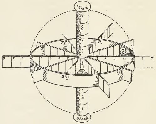
The circle has been known since before recorded history.  Over time, circles have often represented associations such as a circle of friends or from the infamous “Meet the Parents” movie, the circle of trust.  A.H. Munsell was not the first to apply Euclid’s element to color.  As early as 1706, Sir Isaac Newton is thought to have developed the first hue circle in which he varied the size of each segment based on a calculation of wavelength.
Newton’s hue circle demonstrated additive mixing properties and the relationship between primary hues and their complementary color counterparts.  The circle appeared to be more conducive to illustrating the relationship between colors and is still used in the modern day color wheel, which designers use to help choose a color scheme.

Taking the Hue Circle from 2D to 3D

Munsell took the hue circle a step further.  As Munsell’s research evolved, a two-dimensional hue circle was only adequate to describe a single dimension of color, namely hue.  Munsell turned to Euclidian geometry and architecture to more adequately describe the three-dimensional relationship between his three attributes of color—hue, color value and chroma.

Munsell saw similarities between the proportions and ratios explained in geometry and architecture with that of his color sphere.  A visit in 1904 to the studio of artist, Jay Hambidge, helped confirm Munsell’s thinking on ratios and proportions as used in geometry and architecture.  Hambidge’s early work in developing his 1926 theory of dynamic symmetry explained how proportions and ratios were the basis of design in nature and in Greek architecture and sculpture.   Munsell writes in his diary that his work and that of Hambidge had some common points; that is “platonic solids all inscribe and exscribe a sphere” and there are “advantages of a circle as a point of departure.”

Human Visual System Distorts the Color Hue Circle

Munsell was the first to represent color in perceptually uniform dimensions by representing his three attributes of color—hue, value and chroma—in a three-dimensional color space.    His later work, measuring human subjects’ response to color, continued to support his use of a three-dimensional color solid; however, the shape was less uniform since it was based on human visual perception. So although the hue circle or color wheel is still an effective way to represent color relationships, when it comes to visual perception and three-dimensional color space, the circle is somewhat distorted.   Munsell books of color reflect the visual perception of color, making them and effective tool for color communications.

Learn more about the Munsell hue circle and how the hue circle can help you effectively communicate color.

References:

A. H. Munsell Color Diary, 1908-1918, Volume A Part 8.  Courtesy of Rochester Institute of Technology, Munsell Color Science Laboratory.

Color Education in Boston Grammar Schools: Munsell Color Theory

$
0
0

If your ancestors attended a Boston primary school circa 1904 or later, it is likely that they would have learned about color from Munsell’s early color primer, which he refers to in his diary as “MSS.”  Working with Miss Peterson, the Superintendent of Drawing for Boston Schools and Mr. Myron T. Pritchard, Master of the Everett School in Boston, Munsell continued to pursue a color education primer for grammar and middle school students.

Munsell Color Theory & Color Education in Boston

In late September/early October of 1904, Munsell’s meeting with Miss Peterson and Mr. Pritchard finalized the color education primer.  They mainly discussed grades four through nine, and the conversation between Munsell, Miss Peterson and Mr. Pritchard sounded something like this (mostly Miss Peterson and Mr. Pritchard firing questions):

Is solar spectrum a standard – is your circle of hues like it? (Of course, we already know the answer is yes.) How did you get that red?  Is it measured . . . by whom; by what? (Munsell used the photometer to measure color, which he had been working on in parallel with his color education work.) Can children find any color in your sphere? (That’s what makes the Munsell Color Theory so brilliant – any color fits within his model.)  In his diary, Munsell describes, “What this system will do for the child that others cannot do:  describes a color (locates), relate the color to others, writes by a notation, names harmonize and find them.”  This statement still holds true when describing today’s Munsell Books of Color.

color education boston grammar schools

By the end of the meeting the three agreed to demonstrate the “rules” of the Munsell Color Theory by starting with a few harmonious groups of color for each grade.  In his diary, Munsell details the book format as having 28 lines of text and 252 words on the cover; 12,000 words and 50 pages in the body.  A total of 500 copies were printed – 300 for Boston’s primary schools and 200 for Boston’s grammar schools.

Color Education & a Multi-tasking Munsell

Munsell’s color education primer was published shortly before his most notable, A Color Notation, which first published in 1905.  During the development of the primer Munsell had also been working for several years on his photometer, an early color measurement device, which Munsell developed with the guidance of several thought leaders in the areas of physics and science.  Munsell’s photometer has already served a useful purpose as he develops his “color enamels” and papers (to demonstrate Munsell Color Space) and continues to lecture on his system of color.

Learn more about Munsell color education.

References:

A. H. Munsell Color Diary, 1908-1918, Volume A Part 9.  Courtesy of Rochester Institute of Technology, Munsell Color Science Laboratory.


Vintage Advertising Highlights Munsell System of Color Notation in Vintage 1926 Ad

$
0
0

Vintage advertising ads can be both amusing and enlightening. This is an original 1926 color print ad for the Ru-Ber-Oid Shingles Roofing from Ruberoid Company located in Chicago, Illinois.

Like many vintage ads, the copy would be considered quite sexist in today’s society, but the value of Munsell’s Color Systems is clearly evident by the emphasis given.

Ru-Ber-Oid Roofing Shingles Using Munsell System of Color Notation in 1926

“Beauty of color and line appeal strongly to women. As a result they are especially apt to enthuse over a roof of Ruberoid Giant shingles because The Munsell System of Color Notation has enabled us to perfect the blending of colors on the roof”

vintage advertisement for ruberoid shingles & roofing

When we stop thinking about the woman in the red hat being so “especially apt to enthuse over a roof,” the amount of attention given to the use of Munsell’s system of color notation is more evident.

When Vintage Munsell Colors Cutting Edge

When Albert Munsell created the Munsell Color System in 1915 and then, started his own Munsell Color Company in 1917, there was a great need to unify colors. Along with advertising and publications, industry was expanding and coming into its own with mass production and mass distribution. There was a great need to have products be unified and companies needed to produce the same results over and over again through time and, as they expanded, through different manufacturing locations.  Color standards were needed.

munsell color wheel in vintage advertisement

“The Munsell Color Wheel (illustrated above) has made it possible to obtain combinations of colors which are in balance and tonal value.”

By employing the Munsell Color Systems, the Ruberoid Company was able to now ensure that every roof shingle in a particular color combination would be just like another. In 1926, this was a major selling point. This is clearly noticeable by the illustrations of R. E Hallings in this vintage advertisement. The (modified with shingle colors) Munsell color wheel is almost as large as the roof of the house!

Taken from the pages of “The House Beautiful” in 1926, this vintage Munsell advertisement can be found for purchase currently on Ebay.


Everyone Needs a Little Space…3 Dimensions of Color Space

$
0
0

When the average person thinks of color, he or she usually considers the aesthetic aspects of color such as the shade and whether it’s light or dark; or a cool or warm tone.  However, A.H. Munsell saw color in terms of its relationship to other colors, which led him to develop his 3-dimensional color space concept.  He described color space using objects with which most people would be familiar, such as a “color tree” to teach and communicate color with greater understanding and clarity.

Hue Dimension of Color Space

Hue represents the color itself—red, yellow, blue, etc.  The hue aspect of color space dates back as far as Sir Isaac Newton in 1704 with the hue circle.  If you were to take the visible spectrum—red, orange, yellow, blue, indigo and violet—and place each color in a circle, you would have a close replica of the Munsell Hue Circle, which doesn’t include orange.  In Munsell’s color tree, each hue represents a branch of the color tree.  After you’ve established the hue dimension of color space, then you can describe the value and chroma dimensions of color space.

Value Dimension of Color Space

Value is the one dimension of color space that can stand alone. Value represents the lightness or darkness of a given hue.  In Munsell’s color system, value ranges from 0 for pure black to 10 for pure white.  In the absence of hue you would simply have black, white or shades of gray. . . 37 shades of gray to be exact.  The Munsell Color System includes 37 steps in its Neutral Value Scale, an independent set of color standards based on the neutral axis of Munsell’s Color Order System.  The neutral value scale represents the trunk of the color tree with white at the top and black at the roots.

Chroma Dimension of Color Space

Chroma is often described as the brightness or saturation of color.  Chroma is the least uniform dimension of color space, because not all colors can achieve the same level of chroma.  For example a highly saturated red can have a chroma that exceeds 20, while a green may only reach a chroma of 12-14.  Remember, Munsell’s system was based on visual perception of color and was created with paint, so the chroma limits of various pigments used to create each hue will limit the overall chroma.  Use the chroma dimension of color space in relation to value because as you approach the black or white poles of the neutral value scale, chroma is limited, hence the color tree concept where the branches taper at the upper and lower sections of the tree and are widest at the center.   In Munsell’s color tree, numerous branches of varying lengths represent chroma with lighter and lower chroma colors as the upper tree branches and darker lower chroma colors as the bottom branches . . . excluding the conical evergreens, of course! Learn more about Munsell Color Space.

A Grammar of Color – Part 1

$
0
0

Arrangements of Strathmore Papers in a Variety of Printed Color Combinations According to The Munsell Color System

A Grammar of Color was published in 1921 by the Strathmore Paper Company and was intended to explain the Albert H. Munsell color system and then show how it can be applied. The book was 27 pages long, with illustrated text explaining the color dynamics by principle and applications, as well as two plates engraved by Rudolph Ruzicka showing balanced and unbalanced color and 19 folding sample color sheets of Strathmore papers that demonstrate various color combinations. Long out of print, it has become a collector’s item. Now the content is available for you to view through a series of posts in the Munsell Color Blog.

Cover of A Grammar of Color book, by Munsell and Cleland

The book contains an introduction from Albert Henry Munsell (posthumously), followed by explanatory text and diagrams illustrating the application of the color system by Thomas Maitland Cleland, entitled “A Practical Description of the Munsell Color System with Suggestions for Its Use”. After suggestions for how the book should be used and how the book was printed, the rest of the book consists of fold-outs of various colored Strathmore cover papers printed with measured color areas arranged according to the Munsell Color System.

A Grammar of Color Inside Page

So stay tuned to the Munsell Color Blog for new installments of chapters from the book, or check back to this post as we will link to the each chapter here as they are published. See the bottom of this page to subscribe to the Munsell Color Blog and receive updates in your email.

“A Grammar of Color” Chapters:

A Grammar of Color – Part 2: Preface

$
0
0

In 1921 the book, “A Grammar of Color” was published by the Strathmore Paper Company to explain how the Munsell color system can be applied. This Preface was written by the Strathmore Paper Company. They point out how difficult and expensive it was to produce this book, as well as a note about Albert Munsell, his interest in producing this book, and his recent passing.

The Preface is presented here as part of series to make the entire contents of “A Grammar of Color” available online here in our Munsell Color Blog.

Cover plate for A Grammar of Color, a 1921 book about the Munsell Color System.

Like any other work undertaken in a new field, this book has grown prodigiously since its first inception and the task and expense involved in producing it has mounted with its development at a rate which appeared, at times, to seriously threaten its completion. It is, therefore, with what we feel to be a justified sense of pride and satisfaction that this company is able to offer to printers, publishers, advertisers and all others who have occasion to use color a book which, though it calls attention to our own product in the field of paper making, may also add its quota to the sum of human knowledge and be of lasting usefulness to our many friends.

This book presents a system for the measurement of color and for its orderly use, and demonstrates this system upon a number of cover papers selected from the extensive Strathmore lines. The fact should be emphasized that neither the Munsell Color System nor this exposition of it is intended to present a creed or dogma for the use of color, nor to supplant the exercise of instinct and trained perception. It is intended as an aid to the training of a color perception and the quickening of an instinct for color, but failing even in this, a reasonably close adherence to the principles which it puts forth will certainly help to avoid the outrages upon color harmony which are committed in every-day practice.

It is regrettable to have to record here the death of Professor Munsell but a little time before the work of printing this book, the first to treat of the practical application of his theories to a great industry, was actually started on the press. He had manifested an earnest interest in its conception and would have taken keen enjoyment from surmounting the difficulties of producing it. Thus deprived of his wise counsel and his enthusiasm, all concerned in the making of this book have found their task the greater, though not the less worth while.

STRATHMORE PAPER COMPANY

[ 5 ]


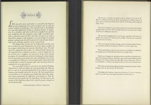
Image of the Preface pages from the book, A Grammar of Color, about the Munsell Color System 

This book was arranged and prepared with the authority of the late A. H.  Munsell of Boston, who spent his life in the perfecting of the Munsell System of Color, and it is the first presentation of this system to the Printing, Advertising and Paper Trade.

The book was designed in its general form and the color sheets have been designed and patented by Arthur S. Allen of New York, who also selected and arranged all of the color combinations shown in it.

The decorations throughout the text, and the type composition of this book, were designed and executed by T. M. Cleland of New York, who also executed the presswork on the color sheets.

The presswork of the text forms, title page, and the color plates by Helen Dryden, was executed by the Redfield-Kendrick-Odell Co. Inc., New York.

The decorative designs on the color sheets and the areas showing color combinations were designed and executed by Rudolph Ruzicka of New York.

The inks used throughout are manufactured and sold by Philip Ruxton, Inc., New York, Chicago and Boston. Any of these may be ordered by the Munsell System of Notation, thus: R5/5 which means Hue, Red; Value, 5; Chroma, 5. These letters and numbers are shown at the right of each pair of color areas on the color sheets.

This book was produced by the Advertising Department of the Strathmore Paper Company, under the direction of C. W. Dearden.

The binding of this book was executed by the Eugene C. Lewis Company, New York, under the personal supervision of Raymond E. Baylis.

[ 6 ]

Back to “A Grammar of Color” Home Page

A Grammar of Color – Part 3: Introduction to the Munsell Color System – The Color Sphere

$
0
0

A. H. Munsell provided the Introduction for the 1921 book, A Grammar of Color, which was published posthumously by the Strathmore Paper Company. The introduction includes sections on The Color Sphere, Balance of Color, and Unbalance of Color.We are presenting each section of the Introduction as well as the rest of the book as part of series of blog posts to make the entire text available online here in our Munsell Color Blog. This section, The Color Sphere, addresses an explanation of color relationships and defining a color notation represented in the form of a color sphere.


An Introduction to the Munsell Color System By A.H. Munsell

The Color Sphere

A CLEAR mental image of color relations must underlie any intelligent grouping of its hues in the best degrees of strength and light. This image is best produced by using a sphere to represent the world of color. With white at the North pole and black at the South pole; and its axis between these points a measured scale of grays, we have a decimal neutral scale which painters call Value. The middle point of this axis must be a middle gray and a plane passing through to the equator must contain colors of middle value. If therefore the equator be spread with a color circle of Red, Yellow, Green, Blue, Purple; and the half-way points by their mixtures in Yellow-Red, Green-Yellow, Blue-Green, Purple-Blue, Red-Purple, we have the equator as a decimal scale of hues merging gradually from one to the next and returning upon itself at Red. Each of these hues is supposed to grow lighter until it merges into the North pole at white, and darker similarly to black, and these are called the values (light) of color. They may also be imagined as passing inward until they disappear in the gray axis. Should there be still stronger colors they will continue upon the same radii outside the sphere. These we call the Chromas (strength) of color. In this way every point inside of the sphere and some upon the outside are arranged in three scales as follows : A vertical scale of light values, a horizontal scale of Chromas, and a circular scale of Hues; and since these are all in decimal divisions it becomes easy to make it a permanent mental image in which to see all color relations. Naturally every point in these three scales has its defined number, just as a solid object has its three dimensions; and to write them as a symbol of that color, thus doing away with the foolish misleading names which are prevalent, we have only to image the three angles of a triangle occupied with the three parts of that symbol—the left hand angle by the Hue initial (Red, Yellow-Red, etc.); the upper angle by a number describing its value in the scale of light; and the right hand angle by a similar number describing its Chroma in the scale from the axis outward. Thus, Vermillion has for its symbol R5/10.

This may seem revolutionary to the business man who has heard no end of fanciful names which fail to describe colors; but each symbol accurately describes the color in its dimensions of Hue, Value and Chroma.

This has all been worked out in permanent color in the “Atlas of the Munsell Color System” and each step bears its permanent symbol. There can be no new color discovered for which a place and symbol is not waiting. With this system in mind it is as easy to understand color relations as to understand musical relations on the written score. Indeed it furnishes the written score which is described in the hand book “A Color Notation.” From this “Atlas”* the pairs of colors shown on each page of this book are mere suggestions to the color printer of combinations which harmonize with that particular cover paper. Always refer back to the “Atlas of the Munsell Color System”* where many other combinations are awaiting.

 The Color Sphere from A Grammar of Color, in the Introduction to the Munsell Color System by A.H. Munsell.

* “A Color Notation” and the “Atlas of the Munsell Color System” may be purchased at any bookstore.

Related Links:


A Grammar of Color – Part 4: Introduction to the Munsell Color System – Balance of Color

$
0
0

Balance of Color, explains the application of color balance and provides three color composition examples that achieve balance, using the color sphere. It is a section of the Introduction for the 1921 book, A Grammar of Color, written by A. H. Munsell. This book was published posthumously by the Strathmore Paper Company. The introduction includes sections on The Color Sphere, Balance of Color, and Unbalance of Color.

We are presenting each section of the Introduction as well as the rest of the book as part of series of blog posts to make the entire text available online here in our Munsell Color Blog.


An Introduction to the Munsell Color System By A.H. Munsell

Balance of Color

The sense of comfort is the outcome of balance, while marked unbalance immediately urges a corrective. That this approximate balance is desirable may be shown by reference to our behavior, as to temperatures, quality of smoothness and roughness, degrees of light and dark, proportion of work and rest. One special application of this quality is balance which underlies beautiful color. The use of strongest colors only fatigues the eyes, which is also true of the weakest colors. In a broad way we may say that color balances on middle gray. Thus a moderate amount of extremely strong color may be balanced by a right quantity of grayer color; and a brilliant point of strong red will balance a larger field of the grayest blue-green. Thus AREA is another quality in color composition, which aids in the balance of Hues, Values and Chromas. Examples of this are all about us. The circus wagon and poster, although they yell successfully for our momentary attention, soon become so painful to the vision that we turn from them. Other examples are magazine covers and the theatrical billboard. These are all cases where color is used only to excite the eye but not for its permanent pleasure. In the case of this book of cover papers, the problem is to so soothe and please the eye that the attention will remain upon them and the applied colors, thereby enhancing the appearance of the paper chosen. The large truth is that general color balances approximately upon middle gray. Although the colors may differ greatly, yet their total effect is balance.

Let us take a point upon the color sphere such as R5/5 . There are three distinct color paths for which this becomes the center. First a vertical path which extends from black through red to white; and in a decimal system is divided into ten equal steps. Equal departures either way from middle red must balance, such as R7 with R3, R8 with R2, R6 with R4, while the strength may be used so as to require equal or unequal areas of each balanced pair. The general law being, that the stronger the color we wish to employ, the smaller must be its area; while the larger the area, the grayer the Chroma. Thus R7/6 balances R3/6 in the proportion of nine parts of the lighter red to forty-two parts of the darker red. In other words, these symbols will balance colors inversely as the product of their factors. This opens up a great field of area in the use of reds, where balance may be restored by changes in the factors of Value and Chroma. Thus the lighter red (R7/6) which we will call 42 balances the darker red 3/6 which we will call 9, by giving 42 parts of the darker (weaker) red to 9 parts of the lighter (stronger) red.

A second path through Middle Red follows the equator of the sphere and again we may balance the Hues once or twice removed; as for instance, RP and YR or P and Y. These are called the neighbors of Red, popularly known as its shades. Instead of neighbors we may select the exact opposite of Red, Blue-Green, which is known as its complement, using equal areas if the colors are of equal strength or increasing the area of the weaker color. This second path does not depart from the level of the equator and therefore all the colors named are of a single Value without contrast of light and dark.

A more interesting path is the third, which may be passed through Middle Red, being neither vertical nor horizontal; but inclined so that if it passes upward out of Red toward lighter Purple it will pass downward from Red into darker Yellow.

These three examples must suffice as a brief introduction to almost endless examples of color series and color intervals that are orderly and harmonious to the eye.

A Grammar of Color – Part 5: Introduction to the Munsell Color System – Unbalance of Color

$
0
0

Using examples like discords in music, A.H. Munsell explains the concept of unbalance of color in this section of the Introduction for the 1921 book, A Grammar of Color, published posthumously by the Strathmore Paper Company.

We are presenting each section of the Introduction as well as the rest of the book as part of series of blog posts to make the entire text available online here in our Munsell Color Blog. The introduction includes sections on The Color Sphere, Balance of Color, and Unbalance of Color.


An Introduction to the Munsell Color System By A.H. Munsell

Unbalance of Color

That any long duration of unbalance, either mental, physical or spiritual is an aggravated form of disease may be easily shown. Yet short periods of unbalance are very stimulating in the effort which they produce to regain balance. We see this in the introduction of discords in music. In contortions of the body. In intentional inversions of thought. This also shows in the seasoning of our food. Too sweet, too salt, too sour. It even shows in our criticism of pictures. We say, too light, too dark, too hot, too cold, too weak, too strong, and the effort of the accomplished artist is to overcome these forms of unbalance. The introduction of a color scheme of a certain moment of unbalance is called harsh color, it leads to its correction by what we call harmonious color (really balance); and the contrast enhances the latter; so that to overcome monotony, we should be able to use unbalance wisely at times, in order that the general balance may be the more evident. This is sometimes done in the picture gallery by means of a so called “gallery of horrors;” — in music by a sudden discord; in behavior by an unexpected rudeness;— all illustrations of the value of the contrast between harmony and discord; and this quality of contrast is proportioned to the use of color. If it is to serve as the background of the picture, the color must be quiet. If it is to be the makeup of the pictures themselves there must be strong oscillations in the contrasts of light and dark (Value), of hot and cold (Hue), of weak and strong (Chroma). As in the case of advertising color, especially in the open air, the very strongest contrasts and even strident relations are admissible. Any attempt in this sketch to encompass this broad question of color harmony would be impossible, and only the few suggestions are attempted to balance and unbalance, to contrast and to accent here mentioned, with their limited illustrations printed in the colors of the various cover papers.

Related Links:


Modern and “Traditional” Color Theory Part 2

$
0
0
Munsell-Color-Solid-Plus-base-color-theory-300x239

David Briggs continues the conversation in Part 2 of Modern and “Traditional” Color Theory.

Traditional color theory uses the ideas of the “color wheel” and the value scale, but typically these are not integrated into any kind of practical three-dimensional color space. For example, in The Art of Color Itten reverts to Runge’s early 19th century sphere model, which (unlike Munsell’s sphere) places the strongest colors of all hues on the equator, irrespective of their tonal value. Itten’s sphere thus ignores Munsell’s recognition of the differences in value and absolute chroma of these colors, and lacks a consistent representation of the vital dimension of value. In contrast, modern color theory makes constant practical use of concepts of color space. Color spaces form a framework for all serious modern investigations of topics as diverse as color perception, color “harmony” and the emotive associations of color combinations. In future posts I will discuss how painters can use the Munsell dimensions of hue, value and chroma as a potent framework for observing colors, for understanding color mixing in paints, and for painting effects of light from the imagination.

 Munsell-color-space-david-briggs

Texts explaining modern color theory for artists began to appear soon after the Helmholtz-Maxwell revolution, the most influential being Modern Chromatics, or The Students’ Text-book of Color (1879) by American physics professor and amateur painter Ogden Rood, which was published in three languages and numerous editions into the early 20th century, and again in 1973. A glance through its 330 pages is a revelation as to the level of technical understanding of color and light that was considered appropriate for art students in the era of Sargent and the late impressionists. Today, excellent introductions to basic modern color theory are available in The New Munsell Student Color Set and James Gurney’s (nicely complementary) Color and Light: A Guide for the Realist Painter, while more detailed information can be found on websites such as Bruce MacEvoy’s immense handprint.com, and my own more modest site, The Dimensions of Colour.

Nevertheless, it is very clear that a great many art teachers are not planning to give up their attachment to simplistic traditional color theory any time soon. Indeed, art and design teachers educated in the age of Itten are now in positions of authority and influence, and have been known to actively suppress the introduction of modern color theory in their institutions. Student demand, fed by awareness of modern color theory now provided by the internet, presents the only prospect for speedy change. The current situation among art teachers is particularly disappointing when we recall that a century ago it was an artist and art teacher who was developing the system that would become the cornerstone of modern color theory.

Fig3

Atlas of the Munsell Color System

$
0
0
Atlas Munsell Color System Book Cover

The Atlas of the Munsell Color System was first published in 1913. It consisted of two sets of charts (15 in total), illustrating the Munsell system of color measurement. We have uploaded a PDF of the Atlas from the original first printing – yellowed, worn pages and all. Below is an outline of what the book covers.

The Color Atlas Outline

Introduction

The color system defined including paragraph descriptions of the following:

Three Color Scales Unite in a Sphere
A Color Tree Surrounds the Color Sphere
Notation of Colors by Symbols
Charts of the Color System
Balance of Color by a Sphere

Chart H

Scale of Hues.
Index for color notation: hue, value and chroma.

Chart V

Axis of the Color Tree.
Value, i.e. the amount of light reflected from pigments,  is the second dimension or quality of color.

Chart C

Chromatic Branches of the Color Tree.
Chroma, i.e. the strength of pigment colors, is the third dimension of color.

Chart R

Scale of Chromas. Red and Blue-Green Chart.
This chart presents a vertical plane passed through the axis of the color  solid and bearing the complementary hues, red and blue-green.

Chart Y

Scale of Chromas. Yellow and Purple-Blue Chart.
This chart presents a vertical plane passed through the axis of the color  solid and bearing the complementary hues, yellow and purple-blue.

Chart G

Scale of Chromas. Green and Red-Purple Chart.
This chart presents a vertical plane passed through the axis of the color  solid and bearing the complementary hues, green and red-purple.

Chart B

Scale of Chromas. Blue and Yellow-Red Chart.
This chart presents a vertical plane passed through the axis of the color  solid and bearing the complementary hues, blue and yellow-red.

Chart P

Scale of Chromas. Purple and Green-Yellow Chart.
This chart presents a vertical plane passed through the axis of the color  solid and bearing the complementary hues, purple and green-yellow.

Chart 20

Dark Scales of Hue and Chroma, Reflecting 20% of the Incident Light.
This chart is a horizontal section through the color solid, similar to chart 50  except that the shorter radii describe a loss of chroma as colors darken.

Chart 30

Dark Value Scales of Hue and Chroma.
This chart is a horizontal section through the color solid, similar to that of  chart 50 except all its colors reflect 30% of the incident light.

Chart 40

Scales of Hue and Chroma, Reflecting 40% of the Incident Light.
This chart is a horizontal section through the color solid, similar to  chart 50 except that all its colors reflect 10% less light.

Chart 50

Middle Value Scales of Hue and Chroma.
This chart is a horizontal section through the color solid, classifying all colors of  Middle Value, by measured scales of Hue and Chroma.

Chart 60

Scales of Hue and Chroma Reflecting 60% of the Incident Light.
This chart is a horizontal section through the color solid, similar to  chart 50 except that all its colors reflect 10% more light.

Chart 70

Light Value Scales of Hue and Chroma.
This chart is a horizontal section through the color solid, similar to  chart 50 except that all its colors reflect 70% of the incident light.

Chart 80

Light Scales of Hue and Chroma, Reflecting 80% of the Incident Light.
This chart is a horizontal section through the color solid, similar to chart 50 except  that the relative chromas change as their hues approximate to white.

From Atlas to Color Book

The Atlas was re-published in 1929 as The Munsell Book of Color which still bears that name today. Are use using these color charts in your work? If so, we would love to hear about it.

Why that Color?

$
0
0
Chromapost building showing a wrapped around banner of various color swatches by Aleksandar Macasev

“…it’s sort of comical how you think that you’ve made a choice that exempts you from the fashion industry when, in fact, you’re wearing the sweater that was selected for you by the people in this room from a pile of stuff.”

- Miranda Priestly
Devil Wears Prada, 2006

Chromapost Project

Five years ago I started a little blog experiment where I would post a single color tone daily at the end of the day. I tried to compress my daily emotional experience into one single color. I was wondering how far we could go in compressing information, beyond Twitter’s 140 characters for instance. More importantly I wanted to establish a very personal and emotional connection with color. Color would be an immediate expression of my feelings with as little external influence as possible. And by influence I mean all the things I was taught in school about color theories and harmonies, color trends and palettes, color coded visual communication, and culture in general. That little blogging experiment has grown into a full-fledged ongoing art project called Chromapost with its many outgrowths.

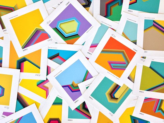
A pile of color swatches with various geometric patterns on white cards

Photo Credit: Collin Erickson

Color Perception, Preference and Expression

Getting rid of external influences on our color choices is quite an impossible task, but aiming in that direction can give us a valuable insight into the nature of those influences and provide us with deeper understanding of color as a cultural phenomenon. We prefer one color to the other when we buy clothes, furniture, house paint, appliances or any product for that matter. If you are a designer, you have to deal with color choices daily. Do you pick them randomly, based on client’s wishes, according to your own tastes, in accordance with a ready-made color palette (we are certainly flooded with those) or based on what those colors culturally communicate in a particular period? It’s hard to give a straightforward answer, isn’t it? And if you’re an artist, color choice options simply explode from copying nature and sticking to a set of made up rules to following your intuition or picking colors by pure chance. The question remains. Why this and not that color?

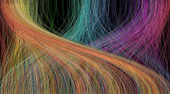
A swirly pattern of lines in various colors shows the influence of colors on emotion

Let’s take a big step back for a second in setting our stage and try to establish what we mean when we say color. The usual scientific consensus says that color is a perceptual phenomenon. In very common terms we could say that there is no color outside our brains. Neither of us can ever truly know if other people see the same color the way we do. Among many episodes I remember one where a friend of mine and I had a heated debate whether the pedestrian stop light (hand) in New York was orange or red. I said orange, he said red and neither would budge an inch. What the other one really sees and what he refers to by saying ‘orange’ or ‘red’ we’ll never find out. This autistic brain cage situation made color studies extremely frustrating, but also challenging and exciting. Since I am going to discuss various relational and cultural aspects of everyday life, color could also be pigment, material, paint, surface, light, message, symbol, idea…

From Color Classification Systems to Meaning

There has always been a tendency to classify and name colors for the sake of understanding what color exactly we are referring to when discussing or using it. The linear spectrum of visible light has been hammered into circles, spheres, double cones or digital color pickers with an exact position for every color within a given system. A breakthrough in industrial standardization of color came with the Munsell color system, which was based on thorough practical research and naming that enabled exact mass reproduction.

An up close wall will square canvas in different colors in a grid format

Apart from giving colors a name and an exact place within a system we have always tried to attach meaning to it, as we pretty much do with everything else. Depending on a particular culture and its complex set of values, commercial practices, price of a color pigment and other various contingent influences color alone began to represent something and to have a widespread symbolic meaning. Color itself became a message. You know, red=stop, green=go, pink=girls, blue=boys… Such processes within society and culture are extremely complex especially when it comes to something so elusive as color. Nonetheless, in the following series of blog posts I will try to scratch the surface and present you with the chief influences on our perception of color, color preferences and expression through color. Examining as much as possible from culture, language and personal memories to commerce, color theory and art history might get us closer to answering the question from the title.

About the Author

Aleksandar Macasev is a visual artist and graphic designer who lives and work in New York City. Everything about the Chromapost project can be found at www.chromapost.com. He invites you to join the Chromapost Social Network at www.chromapost.net, where users can post colors based on their emotions and create art out of it.


Interactive Munsell Color Space Simulator

$
0
0
Diagram of an Interactive Color Space

Much has been written about the Munsell Color System. The system configures a solid sphere used to unite the three attributes or qualities of color: Hue, Value, and Chroma (HVC). How about studying the Munsell Color System on interactive animated images?

My intention when I started making animated figures of the Munsell Color System was simply a way of learning its elements, how it works. So, by way of constant repetition, simply study and learn the system, and then repeat it whenever I wanted, and repeat… and repeat… and continuous learning from the images, until my perception of visible differences in hue, value and chroma, from life-local color, was greatly improved.

The Images & Movements from these Munsell Color Studies, aroused great interest worldwide and encouraged me to continue. Virtual interaction was just a natural evolution for these studies. By introducing the possibility to interact with the image revealed its potential as a teaching instrument of great range. Its everyday use, constant repetition and training, produces a heightened perception of even small changes in color.

Interactive Color Simulator Munsell

It is my conviction that if one’s concentrates and carefully interacts repetitively with the images, learning curve becomes a smooth and enjoyable task, due to its pedagogical and leisure nature. After some practice, even small differences in color changes are perceptible.

Color Relationships Animated

Munsell Color Space – colors are located at the surface and inside a circumscribed three-dimensional space, called Munsell Solid. The solid does not reflect a perfect geometric spherical shape due to differences in maximum radial chroma of the colors. Its parallel circles are perpendicular to meridian lines in equal perceptual steps. The equator parallel is the most important and is the central hue point of reference.

Munsell color space model is the best way to identify and understand the relationship between colors. For example, if an artist wants to elaborate in the identification of a color based on the color of a blob of mixed paints on the palette, it suffices to compare it with a similar hue chip-sample inside the space (Munsell Book) to verify where it is located, how it compares with similar neighbor hues of the same family of color, and define precisely its Hue, Value and Chroma.

By touching its surface and then skipping inside, and travelling in all directions in the interstices of the space, it is apparent that hue (the quality by which we distinguish one color from another) orbits in circular steps, around a vertical axis of neutral gray value scale (vertically graded 0 to 10, in a gradient from black to white). Around this gray scale, hue changes its value in a vertical manner becoming lighter or darker. Also, starting on the central gray value scale, and stepping horizontally towards the surface of the space, hues gradually change from gray to full chroma (intensity or purity of the color).

Hue, Value and Chroma are the main qualities of color defined and organized with great mathematical precision by Munsell in the Color Space. Everything inside the space teaches you how to understand the relationship between colors and how they are organized.

It is fascinating to understand how hue change its value influenced by the neutral scale in such a way that hues are lighter or darker, depending of its relative matched value position; It is also fascinating to infer how hue increases in chroma departing horizontally from its central value in equally perception steps, attaining maximum chroma at the periphery of the circle, and then decreasing towards the central gray value axis (gray color).

To clearly understand the concept of Images, Movements & Interactive Munsell Color Studies, follow the links: Hue, Value, Chroma and Test With Virtual Munsell Chips.

About the Author

Oriane Lima

Oriane Lima is an MD, PhD and Painter whose interest in the Munsell Color System was largely inspired and triggered by the intelligent approach on the subject taught by Graydon Parrish, Dave Corcoran, Steve Linberg and Richard Murdock from Rational Painting and David Briggs and The Dimensions of Color. You can learn more about his interactive system here Munsell Color Studies and Art and view his artwork on his website, www.orianelima.com.

Language… Why that Color?

$
0
0
An array of color lines on a black background with a number naming system associated with them

“The meaning of a word is its use in the language.”
- Ludwig Wittgenstein

My Grandma belonged to the generation that easily slipped German words into their native Serbo-Croatian. She was also a skilled seamstress and I heard her many times referring to various fabrics as being grau, drapp, licht or dunkel.

I had no idea what she was going on about and it all sounded like sheer Grandma magic to me since I didn’t hear these words anywhere else. Licht and dunkel were fairly easy to explain: light and dark. They were usually used to show a quality by comparison like things being lighter or darker than something else. Or lihtije (lighter than) and dunklije (darker than) in German-Serbo-Croatian. Grau and drapp remain more or less a mystery to this very day. She showed me some garments and grau seemed to be some sort of gray of indeterminate lightness. Since it was a woollen tweed-like fabric in my mind, it was a mix of light and dark speckles. Drapp could have been anything between dirtier beige to ochre-yellowish-brown. Although both words are of sentimental value to me, I never dared to use them. They just didn’t have any value outside of Grandma’s dressmaking wonderland.

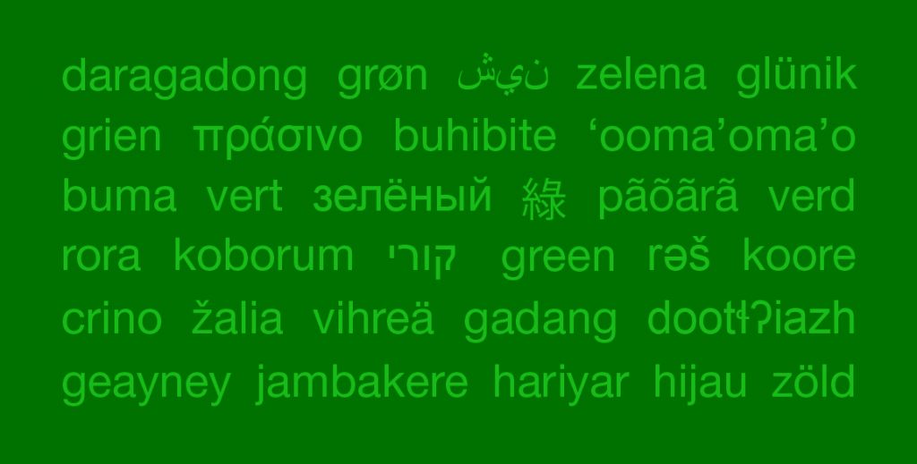
A green box filled with various color names in different languages

Which Color Blue is It?

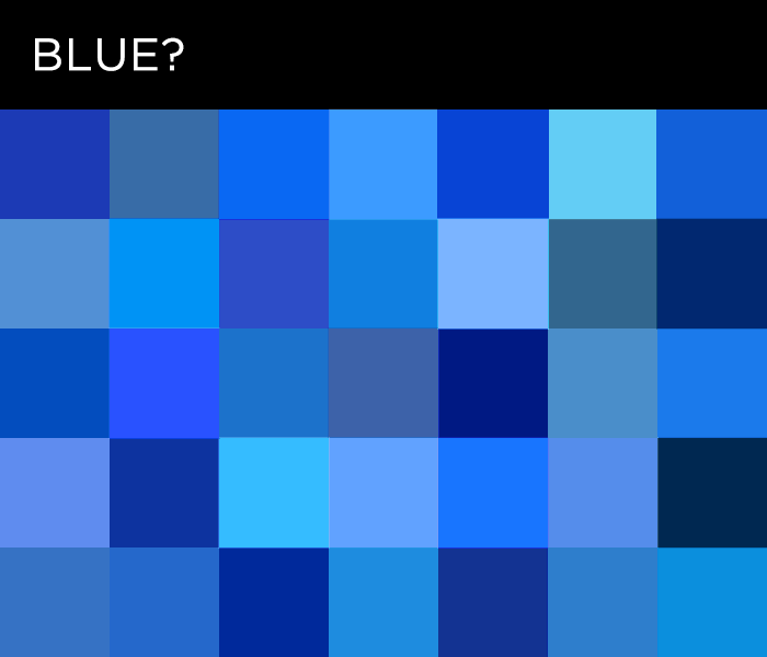
That seems to be the main problem with color names. They exist within fairly well-defined and enclosed linguistic systems and they are conventions created and adopted by a particular culture, as language generally is. Things get even more complicated because codability (capacity of words to convey a precise information) of color names is very low. When we use words for numbers, musical notes or even basic shapes, we are pretty certain that we’ll convey the message without much noise. If you said ‘blue’ I wouldn’t have the faintest idea what exact blue you are referring to. I would have my own image of what that blue might be, but I’m pretty certain it wouldn’t be the same as your image. It is generally understood that color names, no matter how elaborate they are, depict a color class. Word ‘blue’ refers to every imaginable idea of blue.

A box filled with smaller boxes of various shades of blue

Unlike many other terms, color names cannot be defined by other words. Dictionary definitions usually rely on comparisons to objects that are naturally colored that way. If you have never seen anything red in your life, the chance that you will get the idea through language is zero. The color always has to be shown and then have the name tag slapped onto it. I was always wondering about how I arrived at the images I associate with the definitions of colors in my own life. What did my parents point to when they taught me what was green? And did that in any way shape my relation to that color class afterward? Was it loathed spinach, my favorite blanket or just leaves and grass?

By nature we are more attentive to the form and shape than to color. Just remember those horrible art history books where most reproductions were black and white. So in everyday life there is no need to lag thick color sample books around for the sake of accuracy. I think I started paying attention to color as a child with my first set of crayons. Unlike Crayola’s bittersweet, razzmatazz, thistle and mauvelous, my first markers and colored pencils were simply numbered. I remember little about the numbering, except that No.3 was light green. In retrospect, I feel somewhat grateful for having had the opportunity to play with colors unspoiled by linguistic conventions. On the other hand it left me at a disadvantage when people mentioned taupe or mauve. Fortunately many color names are derived from objects like avocado, lemon, grape and lavender so I know where to look for the sample.

Color Names Evolve

Brent Berlin and Paul Kay published ‘Basic Color Terms: Their Universality and Evolution’ in 1969 as a result of their research of evolution of color terms in various languages and cultures. They write that in the first stage of language evolution there are only words for dark and light and all the colors are lumped into these two categories. After that, the word for red appears. In the third stage we get yellow or green and in the fourth stage we have five color terms (black, white, red, yellow and green). Stage five brings blue, stage six brown and finally orange, purple, pink and gray (some say light blue) in any particular order. It all seems pretty neat, but the research has since been criticized for having a Western-centric method and approach. Various cultures and languages often have very different attitudes in discriminating and naming colors. Sometimes colors from the red range get a lot of distinct names, some other times it’s a different range that get more attention. In many cultures other attributes are part of the color definition like wetness, roughness, glossiness and in some cultures people don’t think a color swatch represents anything. The more research is done, the more we move from a universalist, to a relativist point of view.

So, do color names influence our color perception? Probably. It depends on the languages you speak and what culture you live in or you grew up in. There was an interesting experiment mentioned in ‘The Secret Language of Color’ by Joann and Arielle Eckstut where participants were asked to identify which of two color samples of the same hue — one lighter and one darker — looked more like the main sample. Fairly easy task. Except when the samples were around medium value blue and the participants were Russian speaking people. They were much slower with their decision because they couldn’t name the color. That blue fell between their sinii (dark blue) and goluboi(light blue) and the participants involuntarily wanted to name the color first and then make the comparison.

Munsell Color system and many others that came afterward utilize an alphanumeric code instead of a ‘name’ for each color within the system. These are very useful for transmitting the message within a given system because they point to an exact swatch and its position within the chart. You just need the key to accurately decode the message.

With this in mind I decided to avoid traditional color names in the Chromapost project. All of the colors I post are marked only with their hexadecimal RGB values, which don’t convey any specific meaning nor add extra semantic noise. The main message of the post is the color you see or pick.

A chart of various color swatches in a line down a page with code names associated with them

In any case, color names are often indelible from our experience of color, whether they are basic color classes or exotic made up names created by marketing experts to appeal to our emotions. On the other hand, ambiguity of color names has great use in literature and poetry. We generally know what the writer means by ‘blue’, ‘red’ or ‘yellow’, but it’s up to us to finish the picture by imagining our own versions of those colors in our heads, just as I continue to imagine that elusive but emotionally charged drapp from my visits to grandma.

About the Author

Profile in black and white of Aleksander MacasevAleksandar Macasev is a visual artist and graphic designer who lives and works in New York City. Everything about the Chromapost project can be found at www.chromapost.com. He invites you to join the Chromapost Social Network at www.chromapost.net, where users can post colors based on their emotions and create art out of it.


Viewing all 100 articles
Browse latest View live